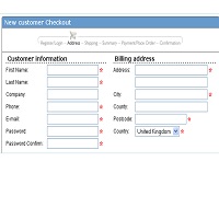
A concerned designer wrote to me: ‘Our forms are laid out in a single vertical column. A new project manager is pushing to get the forms for a new product to ‘look different from other products’ by requesting a twoContinue reading… Two-column forms are best avoided

