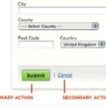
Where to put the buttons on forms? There seem to be endless discussions: Does ‘submit’ or ‘send’ or ‘OK’ go to the left or right of ‘cancel’? Does ‘next’ go to the left or right of ‘previous’? My views are:Continue reading… Buttons on forms and surveys: a look at some research

