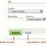
Where to put the buttons on forms? There seem to be endless discussions: Does ‘submit’ or ‘send’ or ‘OK’ go to the left or right of ‘cancel’? Does ‘next’ go to the left or right of ‘previous’? My views are:Continue reading… Buttons on forms and surveys: a look at some research
Tag: placement of labels
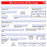
Label placement in Austrian forms, with some lessons for English forms
Here’s a topic that divides UX professionals from ordinary people: label placement in forms. UX professionals get all excited about it, and I plead guilty to joining the discussion. I’ve written about it, included it in my book Forms ThatContinue reading… Label placement in Austrian forms, with some lessons for English forms
UXLX: Label placement in forms – and other time-consuming controversies
Here’s a look at current research into where to place labels – the text that stands for a question – if you want your forms to be usable. This presentation to the 2010 User Experience Conference in Lisbon also examines someContinue reading… UXLX: Label placement in forms – and other time-consuming controversies
Label placement in forms
For ages, I’ve longed to do some eyetracking experiments on how users look at forms. And recently, I’ve been delighted to see the next best thing: excellent work by Matteo Penzo and his team. Experienced users look for the searchContinue reading… Label placement in forms


