Earlier this year, we learned of the bitter legal battles over Terri Schiavo. Her husband and her parents disagreed on whether to continue to give her treatment after she collapsed into a coma seven years ago. Like Terri, I haveContinue reading… Matters of life and death: an investigation of “living wills” and other advance directives
Tag: forms that work
“Easy Read” and writing for people with learning disabilities
For a long while now, I’ve been worrying about how to design forms for people with learning disabilities. It’s not been a pressing problem because frankly, a lot of the forms that I work with don’t even work for peopleContinue reading… “Easy Read” and writing for people with learning disabilities
Hooray, I’m Doing the Forms!
Here’s a little secret that I’d like to share with you: most people just aren’t all that thrilled by forms. They don’t like filling them in, they don’t like thinking about them, and they certainly don’t like the idea ofContinue reading… Hooray, I’m Doing the Forms!
Making a better web form
Which usability changes make the biggest difference? Invited by LoanBright to review their forms, we were surprised by some of the results. Among the changes we tested – layout, wording of questions, addition of extra pages – the only one to make a significant differenceContinue reading… Making a better web form
Five factors for choosing forms software
At any time there are dozens of forms products on the market so how do you choose the right option for physically creating your form? In this paper for the Business Forms Management Association Symposium, I explore five areas you need toContinue reading… Five factors for choosing forms software
Making web forms easy to fill in
Introduction and definitions What is a form? BFMA has its own definition, but for this tutorial I am going to propose one that looks at a form from the point of view of the person who fills it in –Continue reading… Making web forms easy to fill in
Improving usability: case study of Inland Revenue Employer’s Pack
This presentation, given to the 49th Society for Technical Communication Conference in Nashville, USA, offers an overview of my work with the UK Inland Revenue (now HM Revenue and Customs). It records some our findings on usability, and the changes we made as aContinue reading… Improving usability: case study of Inland Revenue Employer’s Pack
Should I use a drop-down? Four steps for choosing form elements on the web
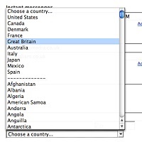
No. Don’t use a drop-down. Updated in 2023. Back in 2001, Sarah Allen and I wrote this paper, and I delivered it at the 48th Society for Technical Communication Conference in Chicago, Illinois. We had done plenty of testing ofContinue reading… Should I use a drop-down? Four steps for choosing form elements on the web
Why users don’t complain about bad forms
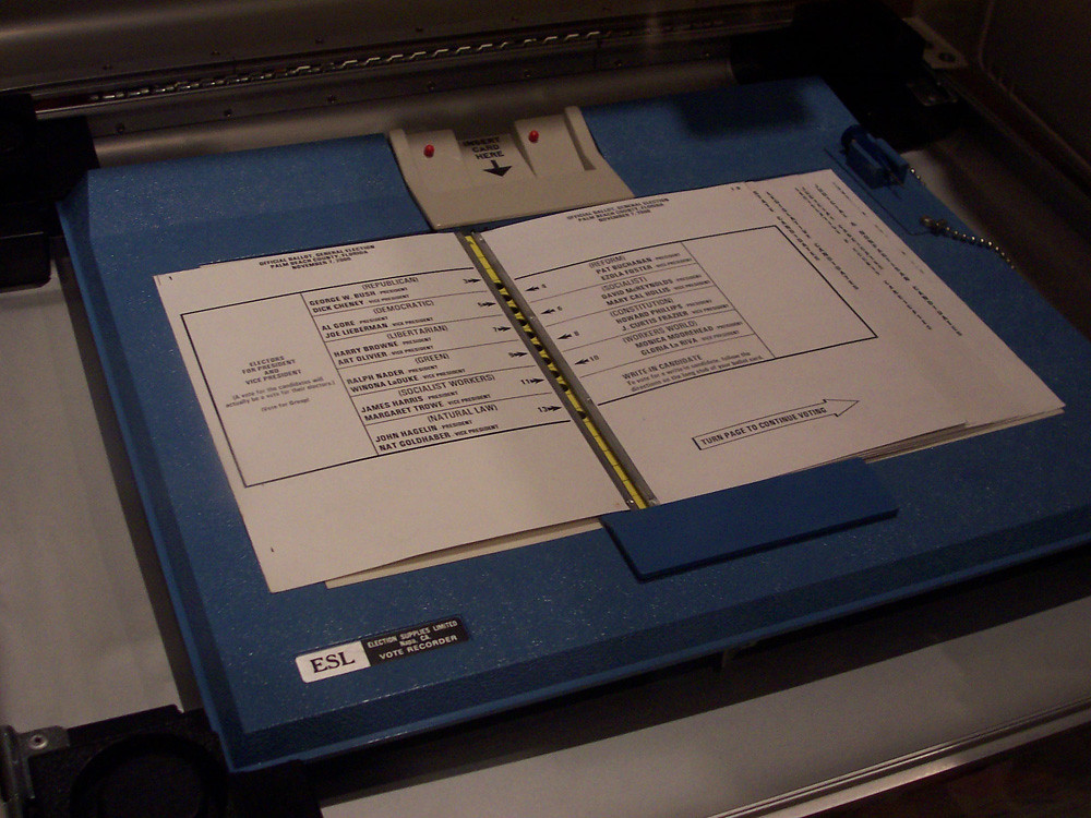
Originally written in response to the Florida vote controversy in the US 2000 presidential election, here are plenty of reasons why you may never know that users are struggling with your form. This article first appeared in January 2001 in UserContinue reading… Why users don’t complain about bad forms
Designing usable forms: the three-layer model of the form
A version of this paper was first delivered at the 47th Society for Technical Communication Conference in Florida. If you want to create a usable form, it helps to understand the three layers: appearance – what people see when theyContinue reading… Designing usable forms: the three-layer model of the form


