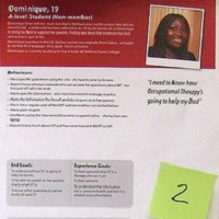
Luke Wroblewski asked me to contribute some thoughts to his book “Web form design: filling in the blanks”. Here’s what I wrote. I love forms, mostly because they offer so many opportunities for improvement. And I love discussing forms withContinue reading… People before pixels: what to think about before you start
Tag: forms design
Forms design: Gerry Gaffney interviews me
Gerry Gaffney gave me an opportunity to talk about forms in a podcast for UXpod. You can find the original on Uxpod. Transcript Caroline Jarrett: And you’ve got my permission to play this to whoever you like under whatever circumstances you like.Continue reading… Forms design: Gerry Gaffney interviews me
How to look at a form in a hurry
Anyone who has heard or read more than one of my presentations will be familiar with my mantra: ‘test, test and test again’. It’s the only way to find our whether something really is usable, and yet we’re sometimes putContinue reading… How to look at a form in a hurry
Two-column forms are best avoided
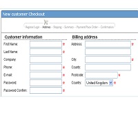
A concerned designer wrote to me: ‘Our forms are laid out in a single vertical column. A new project manager is pushing to get the forms for a new product to ‘look different from other products’ by requesting a twoContinue reading… Two-column forms are best avoided
Hooray, I’m Doing the Forms!
Here’s a little secret that I’d like to share with you: most people just aren’t all that thrilled by forms. They don’t like filling them in, they don’t like thinking about them, and they certainly don’t like the idea ofContinue reading… Hooray, I’m Doing the Forms!
Making a better web form
Which usability changes make the biggest difference? Invited by LoanBright to review their forms, we were surprised by some of the results. Among the changes we tested – layout, wording of questions, addition of extra pages – the only one to make a significant differenceContinue reading… Making a better web form
The value of ‘other’: other countries, other choices
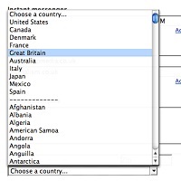
Yesterday I was scrolling down yet another list of countries – must have been over 150 of them. There’s always a slight frisson to the game for me: will I find United Kingdom? Or perhaps I’ll be offered England, ScotlandContinue reading… The value of ‘other’: other countries, other choices
Should I use a drop-down? Four steps for choosing form elements on the web
No. Don’t use a drop-down. Updated in 2023. Back in 2001, Sarah Allen and I wrote this paper, and I delivered it at the 48th Society for Technical Communication Conference in Chicago, Illinois. We had done plenty of testing ofContinue reading… Should I use a drop-down? Four steps for choosing form elements on the web
Designing usable forms: the three-layer model of the form
A version of this paper was first delivered at the 47th Society for Technical Communication Conference in Florida. Most people do not enjoy filling in a form If you want to create a usable form, the first step is to understandContinue reading… Designing usable forms: the three-layer model of the form


