These slides come from a seminar I ran for MSc students at the University of York in February 2011. MSc Seminar on Forms Design from Caroline Jarrett #forms #formsthatwork
Tag: forms design
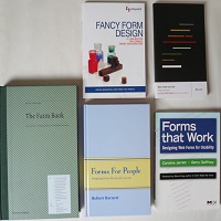
The Top Five Books about Forms Design
It’s December, and we’re coming up to the gift-giving season. In case you want to put something professionally relevant on your wish list—or, perhaps more realistically, in case you haven’t yet spent your 2010 book-buying budget—I’m going to devote thisContinue reading… The Top Five Books about Forms Design
Online forms: saving work or causing stress?
E-forms have benefits, but so do paper forms. To have a successful e-forms project, you need to choose the appropriate level of e-form. This 2010 talk to the International Professional Communication Conference also describes several indicators of e-forms project success.Continue reading… Online forms: saving work or causing stress?
Tips for designing complex forms, UPA2010
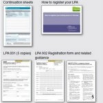
From tax returns to lasting power of attorney, some forms present both designers and users with a huge number of challenges. In this presentation to the 2010 Usability Professionals’ Association Conference, I highlight some of the pitfalls of designing complex forms –Continue reading… Tips for designing complex forms, UPA2010
UXLX: Label placement in forms – and other time-consuming controversies
Here’s a look at current research into where to place labels – the text that stands for a question – if you want your forms to be usable. This presentation to the 2010 User Experience Conference in Lisbon also examines someContinue reading… UXLX: Label placement in forms – and other time-consuming controversies
Can I use an asterix to indicate optional fields?
I was asked recently: ‘Our form has many required fields and few optional fields. We think that we should use an asterisk to indicate the optional fields. Do you agree?’ It makes sense but it is also a bad idea.Continue reading… Can I use an asterix to indicate optional fields?
Usable forms
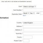
How can we design forms that are easier to read? In this presentation to the Media Trust I highlighted problems in both the ‘conversation’ and ‘appearance’ of some typical forms – and shared tips for improving the experience of users.Continue reading… Usable forms
Where to place labels in forms
Eye-tracking data revealed the good, bad and ugly of forms design, as presented in this talk to UKPA UK – the User Experience Professional Association’s 2009 conference. But the session was also a chance to tackle some of the other controversiesContinue reading… Where to place labels in forms
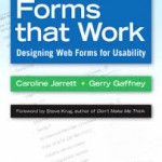
New book published: Forms that Work
Publication day for the book that brings together much of what Gerry Gaffney and I have learned about creating better forms over more than a decade of practice, consultancy, teaching and research. Here is what the publishers Morgan Kaufmann haveContinue reading… New book published: Forms that Work
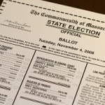
Delivering Better Ballots
“An election is not held to test voters’ ability to follow instructions, but to receive instructions from the voters as to which candidates they will elect. No legitimate public purpose is served by designs that distort those instructions.” It’s goodContinue reading… Delivering Better Ballots

