Jonathan Blum of Entrepreneur Magazine asked me for my thoughts on whether build-it-yourself forms tools can help small businesses. I said: “Not just small firms, but all firms make the mistake of believing that because they have been using a formContinue reading… The form you have or the form you need?
Tag: forms design
How to look at a form – to learn a lot, quickly
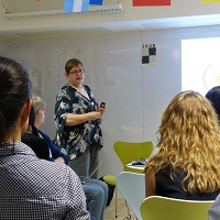
If you look at a form through the eyes of your users then you can learn a lot, very quickly. We tried it recently at a forms studio with Women Who Code London. Don’t look at the form One of theContinue reading… How to look at a form – to learn a lot, quickly
Celebrating inspiring women on Ada Lovelace Day
Women Who Code is the international organisation dedicated to inspiring women to excel in technology careers. I was delighted to be invited to join their London group on Ada Lovelace Day – the annual celebration of a woman widely considered to be the first computer programmer. It gave meContinue reading… Celebrating inspiring women on Ada Lovelace Day
Form design and usability – an interview in the UX review
“Whose work should you be checking out if you’re interested in better forms?” For me, that’s the most interesting question I was asked in a new interview on forms design and usability for theUXreview because it gave me the opportunity to share a host of linksContinue reading… Form design and usability – an interview in the UX review
Eye Tracking in User Experience Design
Eye tracking can be a valuable tool in understanding how users are interacting with forms and surveys – in order to improve them. It’s a topic I’ve presented on many times, such as in this presentation on Visual Forms to the UKContinue reading… Eye Tracking in User Experience Design
Design tips for complex forms, Washington 2013
At the User Experience Professionals Association Conference in Washington in 2013, I returned to the topic of complex forms. I chose the example of applying for a US passport, a typical government process that exposes the challenges of creating a consistentContinue reading… Design tips for complex forms, Washington 2013
Basic best practices for buttons
Buttons on websites? Nothing special: just an ordinary everyday element of interaction design. Despite this, it’s rather too easy to find buttons that don’t conform to some basic best practices. Here are my basic best practices for buttons: Make buttons look likeContinue reading… Basic best practices for buttons
Design tips for complex forms, Malta 2012
Usability in Malta It was a privilege to be invited to present at Malta’s first usability conference. On one of the coldest, wettest nights that Malta had ever known, an impressively large number of keen people made their way toContinue reading… Design tips for complex forms, Malta 2012
Design tips for complex forms, J Boye 2011
I was invited to the 2011 J.Boye conference in Aarhus Denmark to deliver a presentation on designing complex forms. People experience forms at three levels – appearance, conversation and relationship – and complexity affects each of them. Using examples from the UK and Danish governmentsContinue reading… Design tips for complex forms, J Boye 2011
Design questions for complex forms: a study of census envelopes
Census years are exciting times for the forms enthusiast. They’re quite rare – most countries run their census at 10-year intervals. And they affect the entire population. That’s the definition of a census – a count of an entire population. Census forms alsoContinue reading… Design questions for complex forms: a study of census envelopes


