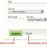
Where to put the buttons on forms? There seem to be endless discussions: Does ‘submit’ or ‘send’ or ‘OK’ go to the left or right of ‘cancel’? Does ‘next’ go to the left or right of ‘previous’? My views are:Continue reading… Buttons on forms and surveys: a look at some research
Tag: buttons on forms
Design tips for complex forms, Malta 2012
Usability in Malta It was a privilege to be invited to present at Malta’s first usability conference. On one of the coldest, wettest nights that Malta had ever known, an impressively large number of keen people made their way toContinue reading… Design tips for complex forms, Malta 2012
Design tips for complex forms, J Boye 2011
I was invited to the 2011 J.Boye conference in Aarhus Denmark to deliver a presentation on designing complex forms. People experience forms at three levels – appearance, conversation and relationship – and complexity affects each of them. Using examples from the UK and Danish governmentsContinue reading… Design tips for complex forms, J Boye 2011
Buttons on forms – where to put them, and what to call them
Here’s a question that I get asked quite often: “Should we put ‘OK’ button to the left or the right of the ‘Cancel’ button?” A common variant is to ask the same question with ‘Back’ or ‘Previous’ instead of ‘Cancel’,Continue reading… Buttons on forms – where to put them, and what to call them


