HTML 2.0 appeared in 1995. At that time, I was working in usability of forms – and I still am. But I didn’t have email or an internet connection. So I think it was remarkably nice of the authors to includeContinue reading… The piece of HTML created just for me: Reset
Tag: better forms
The value of ‘other’: other countries, other choices
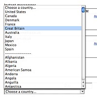
Yesterday I was scrolling down yet another list of countries – must have been over 150 of them. There’s always a slight frisson to the game for me: will I find United Kingdom? Or perhaps I’ll be offered England, ScotlandContinue reading… The value of ‘other’: other countries, other choices
Making web forms easy to fill in
Introduction and definitions What is a form? BFMA has its own definition, but for this tutorial I am going to propose one that looks at a form from the point of view of the person who fills it in –Continue reading… Making web forms easy to fill in
Should I use a drop-down? Four steps for choosing form elements on the web
No. Don’t use a drop-down. Updated in 2023. Back in 2001, Sarah Allen and I wrote this paper, and I delivered it at the 48th Society for Technical Communication Conference in Chicago, Illinois. We had done plenty of testing ofContinue reading… Should I use a drop-down? Four steps for choosing form elements on the web
Designing usable forms: the three-layer model of the form
A version of this paper was first delivered at the 47th Society for Technical Communication Conference in Florida. Most people do not enjoy filling in a form If you want to create a usable form, the first step is to understandContinue reading… Designing usable forms: the three-layer model of the form


