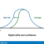
Good forms work across three layers: appearance: are they easy to use and easy to read? conversation: are they easy to understand and easy to answer? relationship: can the user easily get it done and easily move on? I had greatContinue reading… How to look at the content in a form, UK cross-government content meetup
Tag: better forms
How to look at a form, Industryconf 2016
Forms – the only non-optional part of most user experiences, but often the part that gets the least attention. My session at the 2016 Industry Conf in Newcastle was an opportunity to lead the audience through the design of typical formsContinue reading… How to look at a form, Industryconf 2016
Design patterns in government – 2016
How can we design at scale? That’s the challenge that I’m working on with Tim Paul at the Government Digital Service. When Tim first started working at GDS, the designers could fit into a room and sharing was easy. Now we’veContinue reading… Design patterns in government – 2016
Creating forms that help voters take action
The Field Guide Series aims to equip local election officials in the US with the information they need to ensure voters are able to vote as they intend. It was a privilege to be involved in this Center for CivicContinue reading… Creating forms that help voters take action
A community, not a library: design patterns for government services
This workshop at UX New Zealand 2015 was a chance for me to lead a discussion on design patterns and forms elements for the UK government website GOV.UK. Looking at our experiences within the UK Government Digital Service #gdsteam theContinue reading… A community, not a library: design patterns for government services
My new favourite form. Really.
I have a new favourite form: HMRC’s Pay your self-assessment online. Enjoy! But maybe before you do, you’d like a little explanation? OK, I’ll back up a bit and explain. Making better forms isn’t easy I’m a forms specialist –Continue reading… My new favourite form. Really.
Forms studio at UX Bristol
Sometimes conferences are about getting lots of people together in big rooms, often over several days. UX Bristol isn’t like that. It’s one of the hottest tickets in the UK, selling out in minutes, because the organisers deliberately keep itContinue reading… Forms studio at UX Bristol
Design tips for complex forms, Washington 2013
At the User Experience Professionals Association Conference in Washington in 2013, I returned to the topic of complex forms. I chose the example of applying for a US passport, a typical government process that exposes the challenges of creating a consistentContinue reading… Design tips for complex forms, Washington 2013
How to improve a complex form
If you have a long, complicated form then here are some things that you can do to help users through it: Find out which parts of it are truly necessary. Can you simplify it at all, or perhaps delay someContinue reading… How to improve a complex form
The art of writing very little: how to improve your forms
Guest post by Gerry Gaffney, co-author with Caroline Jarrett of Forms That Work: designing web forms for usability. Technical communicators are familiar with the challenges of communicating with audiences who are reluctant to read. Clearly written, thoughtfully designed, well-formatted text isContinue reading… The art of writing very little: how to improve your forms


