This article, by Cathy, was originally part of a collection of personal stories published on the Design to Read website. I suffer from glaucoma (Primary, Open-Angle Glaucoma) and have first-hand experience of visual field defects. Most damage has occurred inContinue reading… Reading with Glaucoma
Tag: accessibility
Liverpool 2008 Design to read – workshop proposal
This workshop proposal, co-authored with Kate Grant, William Wong, Nisha Kodagoda and Kathryn Summers, was submitted to the British HCI Group conference in Liverpool, 2008. We were accepted and went on to hold the workshop at the conference. This versionContinue reading… Liverpool 2008 Design to read – workshop proposal
Two-column forms are best avoided
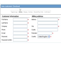
A concerned designer wrote to me: ‘Our forms are laid out in a single vertical column. A new project manager is pushing to get the forms for a new product to ‘look different from other products’ by requesting a twoContinue reading… Two-column forms are best avoided
We need to include people with disabilities in our designs
Recently, I was having an online conversation about the challenges of finding participants for testing – specifically, the challenges of finding participants with disabilities. Someone put the view; “if we’re having trouble finding people with disabilities, then maybe we wouldContinue reading… We need to include people with disabilities in our designs
A farewell to pop-ups
Comment added in 2022: These days we use the term ‘modal’ instead of ‘pop-up’ and I don’t see as much discussion of pop-up blockers. Otherwise, I think this is still accurate. CJ. Do you remember the olden days onContinue reading… A farewell to pop-ups
Flash is 99% good (for the right audience)
A few years ago, Jakob Nielsen got a lot of attention with his “Flash: 99% bad” alertbox. At the time, I thought that it was a bit extreme. Why not allow ad agencies, graphic designers and movie sites to indulgeContinue reading… Flash is 99% good (for the right audience)
‘How to’ manual on forms design: guidelines on font size
This paper presents some of the conflicting advice offered to designers on one particular topic in accessibility: the choice of font size for visually impaired people. This creates practical difficulties for designers when trying to apply the advice. It wasContinue reading… ‘How to’ manual on forms design: guidelines on font size


