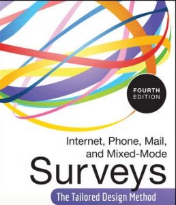
 You’re looking for a book on surveys, and my one isn’t yet out. What do to?
I thought I’d help by sharing some of my favourites over the next few months. These will be the titles that I find myself turning to again and again, whether to check a point I’m writing about or when I’m designing a survey myself.
Top of my list has got to be Internet, Mail, and Mixed-Mode Surveys: The Tailored Design Method by Don A. Dillman, Jolene D. Smyth and Leah Melani Christian (Wiley, 2008).
A book with practical insights backed by research
Why do I like it so much? Well, it certainly isn’t a visual feast. The cover isn’t all that inspiring, and the design features solid blocks of text.
The value in this book is all in what it says. Don Dillman has been researching surveys for 50 years. He’s the author or co-author of over 240 papers, and he’s co-written 9 other books in addition to this book and its three previous incarnations under slightly different titles. All this might lead you to suspect that the book is a dry, academic tome that will be hard work. You’d be wrong.
Yes, it’s impeccably referenced throughout. But it’s also practical. This is a team that believes strongly in testing everything, varying everything, and testing again – in one-on-one usability tests, A/B tests and experiments. I opened my copy at random just now and here’s a typical passage:
“Often web survey designers and programmers are on the cutting edge of computer technology, have the most recent versions of web browsers, and are adept at customising their own settings. However, it is important to design and test the web survey from the respondent perspective; the respondent may not be as computer savvy or familiar with being online. In one of our recent student surveys, we decided to send a tester out to a number of different computer labs at our university because many respondents would be completing the survey on campus. In the process of testing, it was discovered that two labs on campus had not updated their browsers in 5 years. Although many students were aware of that and avoided using those labs, others did not know and may have completed the survey on those computers with the outdated browsers”.
I’m sure it’s not news to you that there is often a gap between what your developers are using as their technology and what the users might know. But how many academic researchers do you know who would be willing to go from lab to lab checking something like that? How many people, when they start to design a survey, ask themselves “How many of our respondents are likely to be on old browsers?” before you raise that point with them?
You may be thinking “OK, but what will I learn in that book that I don’t already know?”
My answer: lots. When I got my copy of this latest edition (pre-ordered, based on avidly reading and re-reading the two previous editions), I went through it marking only the most crucial points that I knew I would definitely need to think about for my book on surveys. Then I went back and challenged myself: is this point absolutely essential for the busy user experience practitioner? The result of this two-step process: a host of markers.
What you won’t find in the book
If you’re still with me, you probably have another question: “If this book is that good, why are you writing another one?”
Even though the book is over 500 pages long, it doesn’t cover the entire survey process. Dillman and his co-authors assume that:
- you have a clear set of goals for the research
- you have the resources to do a proper random sample, and a multi-stage administration process
- you know how to analyse the data.
So there are some aspects missing that we probably ought to think about it – and also, we don’t all have time to read that much. So I’m still working on my (much shorter) book.
#surveys #surveysthatwork
