Is reading on a web site really different from reading on paper?
The answer is: no, not really. We don’t read every word on the web. But we don’t read every word on paper, either.
“Reading on the web is different”
In 1997, Jakob Neilsen’s Alertbox tackled the topic How Users Read on the Web. He pointed out that on the web, readers are likely to scan rather than read every word. He did NOT say that this behaviour is different from the way people read in general.
But I keep coming across assertions that people read differently on the web from the way they read on paper. For example, here’s Gerry McGovern in The Web Content Style Guide excerpt: Writing for the Web: Part 1: “Everyone who’s observed, tested, or studied online reading agrees that people behave differently when online”.
Well, actually Gerry: no they don’t. By which I mean: reading online is a lot more like reading on paper than it is different from it.
Reading on the web is different – from what?
The point is that users read pages differently from other pages. Think about reading these different types (also known as ‘genres’) of (paper) pages:
- a greeting card from a dear friend
- a serious newspaper e.g. the Wall Street Journal
- a favourite magazine
- a piece of junk mail from a credit card company
- your actual bill from the credit card company
- a page from a favourite novel
- a page from a technical manual (“where’s that error message?”)
Now think about reading a web page. Which page are you thinking of? Do you read the page differently? If so, differently from which of my list of pages above?
It turns out that genre is the key. People read blogs differently from news sites. They read search engine pages differently from cartoon sites. They read sports results pages differently from e-commerce pages. They don’t read things that look like adverts no matter what the ‘advert’ really is and no matter where you place it.
But they do transfer reading behaviours from screen to print and back again. For example: reading a middle-of-the-road, illustrated paper newspaper like USA Today. It’s got a nice big picture on the front and a headline. You glance at the picture but read the headline.
What happens on an illustrated news website? It’s not all that different: headlines and captions are where eyes fix first.
Reading a form is like reading a form
And most of all, they read forms like forms. On paper, what they do is:
- look for the next place to write in
- eyes left to see what goes into it
- back to the place to write in to put in the answer
- look for the next place to write in.
And on the web? Exactly the same. For example, see Matteo Penzo’s article Evaluating the Usability of Search Forms Using Eyetracking: A Practical Approach. Especially, the part where the performance of ‘rookie users’ and ‘pro users’ on Google is compared – and both types start by fixating on the input box.
So if it’s a form, they are going to read it like a form – and there’s very little you can do to influence that, so you may as well design for it.
Reading is all about the users
The good news for us usability folks is that instead of worrying about the medium we’re using we can concentrate on the same questions we ask all the time: Who are the users? Why are they reading? What are their expectations?
Reference
If you’re interested in the topics in this article, then I strongly recommend that you read Judy Gregory’s article “Writing for the Web Versus Writing for Print: Are They Really So Different”, Technical Communication Volume 51, Number 2, May 2004. If you are a member of STC, you can get it for free. Otherwise get it from STC’s online journal provider for $10.
A version of this article first appeared in Usability News, July 2006
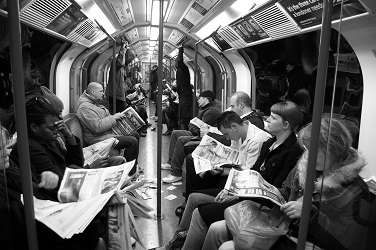
Picture, Reading newspaper, bu x1klima creative commons
