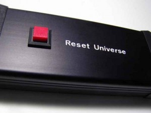
HTML 2.0 appeared in 1995. At that time, I was working in usability of forms – and I still am. But I didn’t have email or an internet connection. So I think it was remarkably nice of the authors to include a piece of mark-up just for me: the RESET button.
Can I hear you thinking: “Hang on a minute, Caroline, RESET buttons are everywhere?”
I agree. They’re everywhere. There they were in the HTML specification in 1995 (and they had appeared before that). So dedicated programmers have been carefully inserting them in their pages for at least 10 years.
But who are these RESET buttons FOR?
I love them. Almost every day, I hunt around on websites looking for forms, filling them in and then gleefully pressing RESET instead of submit. It’s part of my job; that’s what I do.
Looking at forms without filling them in is a waste of time. To get any idea of how a user might react to the form, you have to have to try to fill it in as honestly as possible. Using silly data such as “First name ‘Test’ Surname ‘Test'” just isn’t as effective. So in order to assess a form, I have to complete it. But when I’ve got to the end, then I want to discard everything I’ve put in and RESET is perfect.
Who else uses them? How many real visitors to your website understand the term ‘RESET’? How many of them deliberately look for and press the RESET button so as to discard all their careful clicking and typing? I put it to you: none of them. You show me a person who has pressed RESET and I’ll show you a person who is bemused, disconcerted or annoyed because their form has suddenly gone blank. They meant to press SEND and clicked on RESET by mistake.
Right from the early days, there were plenty of indications that RESET might not be a good name for this button. For example, here is Dave Raggett (w3C guru and author of HTML 4.0, plus many other good things) explaining how to change the name from RESET (in 1993).
The HTML 2.0 specification for forms itself hints that not all is well with the default names, and adds some explanation for the user:
“When you are finished, you may submit this request:
<input type=submit><br>
You may clear the form and start over at any time: <input type=reset>”
Sadly, most websites don’t bother with a proper, descriptive name for the button. They just say RESET. Cue mistakes by the users and their consequent upset.
What To Do About Reset
If you’re especially keen on making your form helpful for usability consultants specialising in forms (a small group, but important to me), then please carry on putting RESET buttons on your forms.
If you truly believe that some of your genuine users are likely to want to throw away their work and start over, then include a button that allows them to do that. Give it a clear name such as ‘THROW AWAY ALL INPUT’ or ‘CLEAR FORM AND START OVER’. Place it well away from the SEND button.
If you don’t think your users want to trash their entries, then scrap the RESET button.
This article first appeared in Caroline’s Corner, Usability News, September 2004.
#forms #formsthatwork
