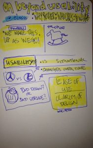
 I’ve got a pet peeve: the phrase ‘beyond usability’. It doesn’t matter who uses it and how appropriate it is to the content of their article, website, speech or whatever. I hear it, I get annoyed, I stop paying attention. Irrational, I agree, but that’s how it is with pet peeves.
And yet, recently I’ve had a few occasions where the good old ISO 9241 definition of usability just hasn’t seemed enough, somehow. A quick reminder for those who think learning this sort of thing off by heart is a silly way to spend part of a day:
‘Usability is the extent to which a product can be used by specified users to achieve specified goals with effectiveness, efficiency and satisfaction in a specified context of use.’ (ISO 9241:11 1998)
Users and context of use
I’m completely happy with the idea that users are central to our definition, and also that they’re using whatever in some context of use. Effectiveness (‘can I do it at all?’) and efficiency (‘how easily can I do it?’) still seem robust and helpful.
It’s the ‘specified goals’ and the ‘satisfaction’ that are bothering me.
Specified goals
Last week, I was testing a fragile prototype of a major redesign of a client’s website. Our particular group of users included an elderly lady who had barely used a computer before, but was planning to get one.
She knew that she had a mouse, keyboard and screen but wasn’t at all comfortable with any of them. No worries: it was just a matter of recalling the usability tests of the early 1990s and trying to be encouraging without being patronising.
But her goals? She didn’t have any ideas at all. And why should she? The website really needed to create goals for her by offering suggestions about what she could do. My carefully prepared suggestions for tasks she might try were much too fancy.
We needed something like ‘try clicking on it to see if there is anything interesting’. Actually, that’s quite a realistic goal for many websites but somehow it feels too vague to fall into the ISO 9241 definition. So I’m brooding at the moment about *unspecified* goals and how to make them a realistic, measurable design target.
Satisfaction
Then there’s satisfaction: a concept that’s both static and slippery. ‘Static’ in the sense that it’s a one-shot type of concept: you’re either satisfied with whether the product allowed you to achieve your goals, or you’re not. ‘Slippery’ in the sense that it can have so many meanings pushed into it: delight, enjoyment, a mild lack of discomfort, a major thrill.
5Es definition of usability
I think Whitney Quesenbery’s five Es (‘effective, efficient, engaging, error-tolerant, easy to learn’) have helped tremendously with the ‘static’ problem.
‘Engaging’ captures the sense of something that a user might find satisfying enough to stick with it or return to.
‘Easy to learn’ helps to get us over the problem of initial use being different from continuing use.
‘Error tolerant’ brings in the ‘hygiene factors’ (as in Herzberg’s theory). We’re not really going to be delighted if the product fails to break, fall over, or mess up in use: these are hygiene factors and they should simply be there. And it shouldn’t do any of these nasty things to us even if we make a mistake.
Emotions in the context of use?
I’m still brooding on the ‘slippery’ parts of satisfaction. Perhaps it’s time to bring in emotions? Could we specify some emotions when we specify the users, or perhaps they’re in the context of use?
For example, let’s restrict products to websites for the moment. Compare three websites that I visit constantly: www.hmrc.gov.uk; www.google.com and www.dilbert.com.
For the tax site, ‘satisfaction’ is mostly about getting in and out with whatever it is I’m looking for – sprinkled with a little bit of worrying about whether I’ll get it right and whether they’ll treat me fairly.
For the search site, ‘satisfaction’ is mostly about hygiene factors: I expect it to be there, to be working, to serve up a good selection of stuff. It’s about dependability and speed. It’s not really ‘engaging’ because I don’t want to notice it especially.
I just want to move on to whatever I’m looking for. It’s almost an absence of emotional reaction – but there’s also an underlying trust. It’s delivered me enough good material over the years that I’ve learned to trust it.
For the comic strip site, it’s about fun. It raises a laugh frequently enough for me to put up with the ghastly, busy design, the annoying pop-ups, and the slow speed.
So, fairness, trust and fun. They certainly don’t apply equally to every product – but they seem a little bit ‘beyond usability’ to me. Oh no, I said it!
So help me. What emotions or other aspects of usability do you think we should add into the definition? And will satisfaction’ encompass them? Or how do they fit in?
(Declaration of interest: I work regularly with Whitney).
This article first appeared in Usability News, 29 November 2004
Picture Beyond Usability by Fabian Fabian creative commons
#usability
