 Here’s a little secret that I’d like to share with you: most people just aren’t all that thrilled by forms. They don’t like filling them in, they don’t like thinking about them, and they certainly don’t like the idea of having to design them.
But forms are the lifeblood of government and much of industry. They’re also pretty important (thinly disguised as questionnaires) in academia. A web form is the difference between a static, information-providing website and an interactive, service-providing one. Think of the life events that require filling in forms, starting with registering a birth. Or think of the zillions of everyday forms that we encounter: signing a credit card voucher, logging on to our computers, booking a meeting room.
So if you get the chance to work on a form, don’t be dismayed, and don’t turn down the job. Accept the challenge. Look at it this way: the chances are very good that you’ll improve the form, thereby making lots of people’s lives just a little bit easier.
The unpopularity of forms
Paper forms are just black marks on dead trees. On-screen forms are just coloured dots on a screen. Why, then, do these everyday objects create so much antagonism?
I think there are three main reasons. First, many forms represent a nasty point in the relationship between the form-filler and the form-issuer. Form-fillers, whom I prefer to call users, may feel intimidated by the form-issuer, usually an organisation. Often there is a significant imbalance of power between the organisation and the user, and sometimes the organisation has the force of law behind it.
Second, users frequently find the questions difficult to understand or answer. The question-and-answer sequence creates a sort of conversation between the organisation and the user, with one side of the conversation fixed in advance. The organisation doesn’t know that the questions might be problematic, and the user feels forced into unwelcome or incorrect answers.
Third, forms often look ugly. In the interests of saving a little space, their creators have used fonts that are too small to read, answer spaces that are too small to write in, and layouts that are confusing. These appearance issues can create a bad impression before users even try to answer the questions.
Designing forms: the first step
The first step in forms design is to understand the relationship factors. This part of information design is about understanding the person with whom you are communicating – and the purpose of that communication. Ask yourself these questions:
- What is the purpose of the form? What does the organisation get out of it?
- What is the reward for the users? What’s in it for them?
- What task the users are trying to complete, either with this form or the overall process of which this form is a part?
- How do the users feel about the organisation?
- How much effort (time, mental work, and other resources) will it take to fill in the form?
- What do the users expect to have to do? Is that expectation in line with the effort that will be needed?
- In what circumstances are the users filling in the form? Are they likely to be interrupted, travelling, or in a public or noisy environment?
Were any of these questions a bit tricky? Are you sure of your answers? My experience is that often we’re working on forms without really understanding the relationship between their originators and their users. If you don’t have up-to-date user data that allow you to answer these questions easily, then it’s time to find some. Good sources of information are stakeholders such as the organisation’s marketing or customer service departments. Even better is finding a way of asking the users themselves.
Then think about the questions and messages on your form. For example, here are some ideas to start you off:
- Asking for something that is unfamiliar? Maybe you need an explanation about why you need it.
- Should the form’s tone be upbeat, neutral, or even apologetic? Thinking about how users feel about the form will help you here.
- If the users are likely to be interrupted part-way through an electronic or Web form, they will need a way of saving it to complete later.
Creating an easy conversation
Creating a good conversation is all about good writing – and good editing, as you create text that is as short as possible while still being clear. If you’re worried that your writing skills may be a little lacking, then consider hiring a technical communicator (also known as a technical author).
If you are a writer, then here are some tips for a better conversation with users.
Use no more than 150 words in the preamble
The preamble is the instructions that introduce the form and precede the questions. But users don’t want to read the preamble; they want to go straight to the questions. If you limit yourself to 150 words, there is a chance that they may take in what you say.
Organise questions into groups according to users’ views of what goes together
Users expect to see questions grouped in some way. Make sure that each group is a coherent set of questions that they consider to be related. You can name each group individually if you wish, or call each collection by a grouping word such as ‘section’, or simply number them.
Use groups to show progress
It’s less daunting to answer seven groups of questions with six to nine questions each than to answer fifty-six questions. On an electronic or web form, you can help users by providing a progress indicator that updates as they work through the groups.
Have a privacy policy that is easy to find
In most countries, you are under a legal obligation to safeguard personal data such as names and addresses. My experience is that only about 10 percent of users actually read the privacy policy, but most of the remaining 90% want to see some reassurance that it exists and that they could read it if they wished.
Justify your requests for private data
If users consider your request for private data impertinent or irrelevant, they will not answer these questions. On paper, they’ll just leave the questions blank. On electronic or web forms, they’ll try to leave them blank – and often will enter inaccurate data if forced to answer.
Indicate required fields on electronic or web forms
If you are creating an electronic or web form, put an indicator such as an asterisk against required fields. Put an explanation of the indicator above the first required field. You can put the indicator before the label or before the answer space – either approach will work fine. But don’t put it after the answer space – users will miss it.
Avoid ‘Reset’ buttons on web forms
The HTML standard allows ‘Reset’ buttons, but that doesn’t necessarily make them a good idea. Users rarely want to discard the hard work that they have done to fill in the form, and many of them may not understand the word ‘Reset’. If you truly believe that some users will want to throw away all their inputs, then provide a button labelled clearly with instructions such as ‘Discard all inputs’ or ‘Throw away my work’. If your users won’t want to discard their inputs, then don’t have a ‘Reset’ button. ‘Reset’ buttons sometimes have a purpose on input dialogs, where the user may want to set changes back to an initial value. In this context, they should be labelled clearly with phrases such as ‘Discard changes’ or ‘Go back to previous values’. For paper forms, you might consider offering users a way to get a replacement form if they make a mistake.
Making the form attractive
The arrangement of instructions, questions, and answer spaces on the page will create a graphic design all on its own. But you’ll get a more attractive form if you involve a graphic designer. (If you happen to be a graphic designer, congratulations!)
If you are not a designer, then here’s my top insight into making a form look good: design to a grid. Draw a vertical and horizontal grid on paper or on screen, and make everything line up with it. Then remove the grid. I find that this practice helps me to make a neater form.
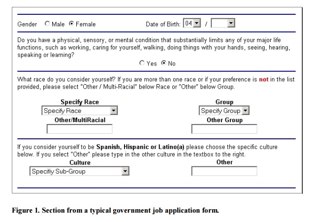
Here is an example. First, let’s look at a section from a typical government job application form (figure 1).  We realise the questions need some work – and that’s going to take some time as we have to get the legal department to agree to change them. Meanwhile, we can definitely tidy it up visually.
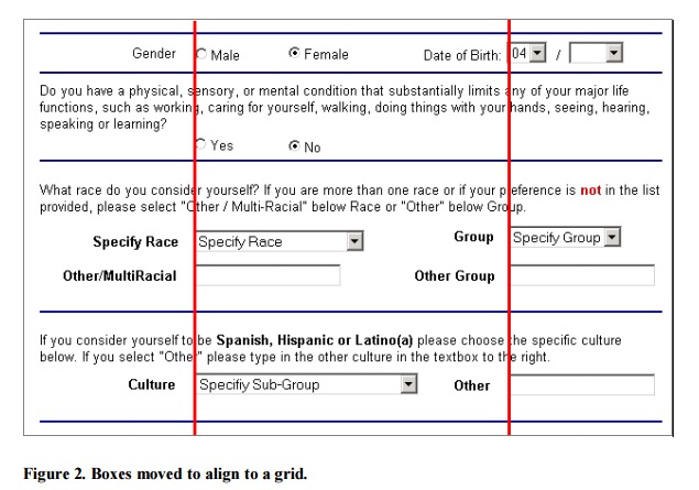
Here in figure 2 is the same form with the boxes moved about so that they align to a vertical and horizontal grid. I’ve left in the red vertical gridlines. I’ve also moved the text slightly so that the text is closer to the box it belongs to than to the horizontal dividing lines.
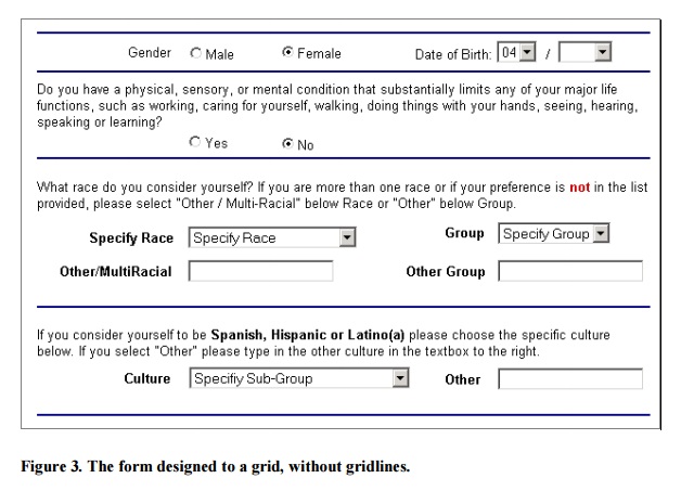
Now, let’s see the form without the gridlines. Do you agree that it looks just a little tidier, and perhaps a bit less daunting? 
Good forms are about being thoughtful and taking care
By now, you’re probably thinking that good forms design is just common sense. You’re right. Like so much in communications design, working with forms isn’t really about thrilling insights or moments of genius. It’s much more about being thoughtful and taking care by doing the following:
- Think about your users, to understand the relationship between those who create and employ forms and those who provide them with desired information.
- Use your writing and editing skills to create a good conversation.
- Be careful how you position the elements of the form on the page – you’ll create a more attractive appearance.
Soon you’ll be finding forms as fascinating and rewarding as I do!
This article first appeared on the front cover and in the December 2004 edition of Intercom, the Magazine of the Society for Technical Communication.
#forms #formsthatwork
