When I was working on tax forms in the early 1990s, I I realised that a tax form is frightening before we even get it out of its envelope. That led me to creating my three layer model of the form: Designing usable forms: the three-layer model of the form (2000).
Now, we’re mostly thinking about interactive forms and we mostly use different terms. But we still need forms to work well in many ways:
- Easy to interact with: the boxes to type into, the buttons, and the other interactions that make up the page (Appearance, or Interaction Design)
- Easy to understand: the questions, instructions, error messages and other words (Conversation, or Content Design)
- Easy to get it done, to finish whatever task had a form in it: the purpose of the form for both whoever issues it and whoever has to complete it (Relationship, or Service Design)
Good forms need interaction design
These are the topics in interaction design that I’m asked about most frequently:
- Sentence or title case in forms? (quick answer: sentence case because it’s more familiar so slightly more legible)
- Don’t put labels inside text boxes (and don’t put hint text inside text boxes either)
- Basic best practices for buttons such as ‘Label the button with what it does’
- No more accordions and don’t be afraid of the big long page
You’ll also see many of my ideas about how to do great interaction design in forms within the GOV.UK Design System and the NHS digital design system.
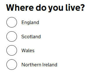 The idea I’m most proud of is the use of extra-large targets for radio buttons and checkboxes. In user research, I observed that many people were aiming for the small round radio button targets or for the small square checkbox targets, even though the text describing the meaning of the targets was clickable. People with good motor control and digital skills were being slowed down; some disabled people, especially people with tremor, were really struggling.
It was an easy idea to have but turned out to be very hard to implement so many people worked for a long time to make it happen. Tim Paul explains the evolution of the design in his GOV.UK blog post on radios and checkboxes.
Good forms need good content design
- Advice on writing good questions: How to write good questions for forms
- Key issues to think about when you’re designing a form: Designing forms that work
- Reviewing existing forms to improve them: Forms workshop – some suggestions on delivering a better experience for users and better information for you.
Complex forms still fascinate me
The first forms I worked on were tax forms, espcially the UK Self Assessment tax return. I’m still fascinated by the challenges of the great big, complicated forms.
- Prune and tune your forms – a webinar for Lunch and Learn
- How to handle complicated forms: Design tips for complex forms – this presentation to the UXPA conference in Washington 2013 offers advice on how to handle forms that have many fields, use complex terminology, or involve challenging tasks.
These are my most recent posts on better forms
- Creating truly accessible forms – workshop for Ladies that UX Seattle
- Who cares about forms? You should, and here’s why – Chicago Camps Tent Talk
- Failing to fix your forms is costing you money
If you’d prefer to see everything I’ve ever written about forms, have a look at my publications list.
I also offer consultancy to help you to make your forms more effective
I have been helping organisations to make better forms for more than 20 years. My book is Forms that work: designing web forms for usability.
I can help you with your forms by reviewing them to:
- make them easier for your customers to fill in;
- ensure your processes will deliver the information you need;
- support you in testing to make your forms as effective as possible.
Read more about consultancy and training options.