 A few years ago, Jakob Nielsen got a lot of attention with his “Flash: 99% bad” alertbox.
At the time, I thought that it was a bit extreme. Why not allow ad agencies, graphic designers and movie sites to indulge in gratuitous animation, unnecessarily redesigned widgets and slow-to-load splash pages? But I agreed that Flash probably wasn’t a great choice for information-providing websites, and definitely a bad choice for government websites.
A couple of weeks ago, I had to do a complete U-turn. I learned about www.rizer.co.uk, a website supported by a collection of backup services such as a telephone helpline (nb sadly, at the time of re-editing this article, the site no longer exists). Peter Armstrong, Richard Dumbleton and Simon Mottram of rizer.co.uk gave a fascinating talk at the recent ‘Websites in the Public Sector’ one-day conference organised by Kable.
This website is aimed at young people (11 to 17) in the Nottingham area who are involved in crime or on the fringes of crime. These kids:
- may be on drugs
- are skipping school
- are likely to have low literacy levels
- have a short attention span
- don’t like authority
- and, worst of all, just don’t care.
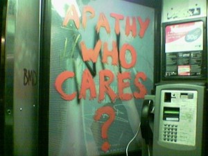
Peter Armstrong said: “Their biggest problem is apathy”. But they’re also from a group that is into music and has high expectations of animation and video. This website really needed to do something that would catch and hold their attention.
Designing for your audience
So, into Flash. This site has it all, including a game to play while the main storylines are loading. To help with the low literacy problems, they’ve put short clear sentences on each screen and a voice with a Nottingham accent reads each one aloud. To help with the attention span problem, the content is chopped into realistic stories that bring together important issues. You can follow each story through, or stop to ‘discuss’ something with your choice of avatar. There’s also an interactive map of the justice system that takes you through loads of complicated jargon in a relatively painless way.
I’m sure you’ll spot a few usability problems. When I used it, I found it rather slow, with somewhat annoying music and I could probably pick a few more nits. Then I remembered that it’s not aimed at me.
You’ll also spot a few accessibility problems. This site really isn’t much good if you’re visually impaired. According to the project manager, that happened because of a combination of funding issues and priorities. They put their efforts into making a site that’s really engaging for their primary targets in the hopes of creating a success to help their campaign for future funding. Let’s hope that they are successful in persuading the powers-that-be to put in some more money so that they can continue to keep the site open and develop it for other groups and localities.
Is it successful? Since the launch, it’s generated hundreds of calls each month to the follow-up helpline. The Criminal Defence Service in Nottingham has asked duty solicitors to inform all charged young people about the site. And anecdotal evidence is that the young people like it.
And the secret of successful Flash? Turns out that that this project used classic user-centred design throughout the development, starting with the focus groups that helped to develop the brand and continuing with lots of testing.
This article first appeared in ‘Caroline’s Corner’, in the November 2003 edition of Usability News.
featured image by Libby, creative commons
