Last week I was deep into one of my favourite things: brooding on web traffic data. And it got me thinking about the joy of measurement – particularly in the context of making websites easy to use.
Usability testing is such a powerful, cheap and interesting method of finding out about how well a website is working that we sometimes forget that it can’t tell us everything. For that matter, traffic measurement can’t tell us everything either – but it can provide some complementary information that helps us to test better and design better.
So here are some Dos and Don’ts.
DO measure your traffic
As a minimum, find out how many visits you get. What pages are most popular? Any surprises?
A story: I was commissioned to test a small marketing sub-site for a big client. Before we tested, we checked the traffic data. Turned out one link was massively more popular than the others. So we thought about why none of the others was attracting any attention – and it was pretty obvious once we looked at it. We tested a prototype improved version rather than the existing poor version and saved quite a lot of development time.
DO think about exclusions from the measurement
Do you have a lot of staff? Are they likely to use your website?
A story: My consultancy website isn’t intended to get a lot of visitors. It isn’t meant to be www.bbc.co.uk, with constantly fascinating information for everyone. So it turns out that the most frequent visitor is me, checking the links and ensuring that links posted into emails are correct.
DON’T get obsessed with it
The patterns vary day by day, week by week, hour by hour. Someone mentions your site on a list and you get a sudden jump. Trying to keep track of jumps and drops as they happen will just burn your time. Sure, use the data to help you plan the bandwidth you need, and the resources for follow-up such as answering emails or taking phone calls. But keep away from the hour-by-hour monitoring unless you are following a specific event such as a new product launch.
A story: Have you ever looked at the Amazon.com ‘sales rank’? These rise and fall as a book sells or stops selling – and they become a matter of obsession for the author (or even the aspiring author looking at the competition).
DON’T become enmeshed in the detail
You will never find an explanation for every path through your site. Try to keep to the overall trends. It’s the internet: people have all sorts of strange reasons why they jump in and out of your site in peculiar ways.
A story: around November and December, the STC Usability SIG website had a spike of hits to a short humorous article from several years ago. The article is about discovering instructions for how to defrost a frozen bird buried inside the carcass. The title of the web page: How to Defrost a Turkey. (PS: The page does include the actual instructions, so hopefully all those people Googling for cooking assistance found what they needed.)
DON’T think that traffic measurement will tell you why things are happening on your site
It’s great for telling you ‘what’ but you’ll have to use other methods for finding out ‘why’.
A story: a client was concerned that their traffic data showed that a big proportion of visitors were clicking off the home page before it fully loaded. The penny dropped when a colleague was looking at the site over a dial-up line. The top menu was text and appeared almost immediately, so she could click off to the page she wanted without waiting for the rest of the page to load. She organised a quick round of usability testing and bingo: the users were doing exactly the same thing. Easy to use, but a pity because they weren’t seeing all that was available on the site. So that prompted some careful thinking about what to present first to the users.
Thanks to Marcos Richardson and Whitney Quesenbery for help with this month’s article.
This article first appeared in Usability News
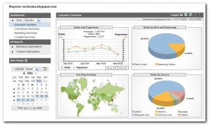
Image Google Analytics by Lordcolus, creative commons

