 These guidelines are co-authored by Janice (Ginny) Redish, Kathryn Summers, and Caroline Jarrett.
Orignally published in the June 2010 issue of UXPA User Experience, our work orginated in the ‘Design to Read’ project.
Design to Read: guidelines for people who do not read easily
Many issues cause people to have problems reading, including:
- Physical problems (vision, motor control, and more)
- Cognitive problems (aphasia due to a stroke, congenital cognitive impairments, dyslexia, memory loss from aging, and more)
- Low-literacy (lack of schooling, poor access to reading materials, and more)
- Trying to read in a second (or third or fourth) language.
Even those of us who are skilled readers have moments when we have difficulty reading, perhaps due to:
- Lack of time
- Fatigue
- Stress
- Technology (reading on a mobile phone or other PDA)
- Environment (reading in a crowded, noisy room, or with too little light).
Faced with all these different groups and reasons for difficulty in reading, what should we do as designers?
Researchers tend to focus on one of these causes, trying to learn more about, and then help, their specific special population. They meet with, write for, and talk with others who focus on the same population.
The core idea of the Design to Read project is to put researchers in contact with each other, and with practitioners, to help each learn from the other. We hope that we can find more similarities than differences in what works best for helping people who do not read easily. In this article, we explore the possibility that similar guidelines for designing and writing clearly and simply can make reading easier for many groups and many situations.
What makes reading difficult?
Reading is a complex process that starts with recognising words. Skilled readers use a combination of recognising word shapes, processing letters in familiar chunks—like “ing” or “tion”—and reading words in clusters that are relevant for meaning. Reading letter by letter is a last resort for unfamiliar words. Skilled readers in a hurry read selectively, skimming and scanning to pick out crucial points.
This process is easily disrupted from the physical level (think about reading a small, pale grey, complicated font on white background), to the cognitive level, like making sense of complex sentences written in unfamiliar language (typical legalese, anyone?). As we read, we are using working memory to help us extract meaning from what we read.
Less skilled readers often misrecognise words, substituting a more familiar word for the word on the page. They then try to make sense of sentences with words that don’t really fit together. They may struggle through words letter by letter, but usually, they too take shortcuts. Their skimming and scanning becomes random, reading any segment they alight on, creating confusion rather than understanding.
Everyone has limited working memory
For those who do not read well—whether due to literacy reasons, vision-related challenges, or other causes—the working memory resources that might normally go into making sense of the material is instead used up by low-level information processing. This diversion of resources has serious consequences for cognition:
- Reading speeds go down.
- Comprehension is reduced—words and visuals are likely to be interpreted very literally.
- The ability to separate the important from the unimportant is reduced.
- The ability to make inferences, understand relationships, and make connections is reduced.
All of these lead to satisficing, the conscious or subconscious decision to “make do” with whatever meaning has been gleaned from the material. Highly skilled readers tend to satisfice when they have a good enough sense of the material to meet their goals. People who do not read easily are often forced into satisficing too early, when they’ve struggled as much as they can but have not yet met their goals.
Factors that affect one group may also affect others
By combining our research with different special populations, we can see similar behaviors and issues across groups. Let’s look at how three different groups react to just one problem: web pages full of long, dense paragraphs of text.
- High-literacy readers often react to dense text by hopping from link to link, looking for something simpler that meets their needs.
- Low-literacy readers often skip chunks of text more than three sentences long. They try to minimize the amount of reading they have to do by focusing on finding links instead of reading content. They, too, hop from link to link, sometimes ignoring page content completely.
- Listeners who rely on screen readers are equally impatient. They set the screen reader to read only the links on a page. They may end up hopping from link to link within the site, not even realizing when they have arrived at a page with desired content.
These groups can be helped by making the text much easier to cope with, as well as by using fewer, more informative, carefully chosen links.
Helping one group helps others
Research shows that improvements aimed at a particular population (for example, older adults or low-literacy readers) can help everyone.
Example: A study at Fidelity Investments by Ann Chadwick-Dias, Michelle McNulty, and Tom Tullis tested a system with younger and older adults, and found that the older adults had significantly more problems and lower performance on a set of tasks. They then created a prototype that fixed the problems encountered by the older adults. As expected, the performance of the older adults improved. But the surprising finding was that the performance of younger adults also improved.
Example: A study by Kathryn Summers and Michael Summers focused on low-literacy adults dealing with information about medicine. They had similar results to the Fidelity study. After testing the original website with low-literacy and high-literacy readers, they redid the site to meet the needs of low-literacy readers and tested again. The changes helped the low-literacy readers immensely. But, once again, the surprising finding was that the changes helped the high-literacy people even more.
Some things that one group needs make no difference to others
We acknowledge that the overlap in behaviors, issues, and solutions is not complete. Solving all the problems for one group may still leave difficulties for another.
- We still need alt-text for those who listen to the screen.
- Some short and simple words may be problematic for dyslexics.
- Specific technical words may be “plain language” to people in that technical field.
Even within a specific population, individuals differ. Different types of aphasia mean individuals have lost different abilities. Older adults vary greatly along several dimensions, as Redish, Chisnell, and Lee have shown. Even with the changes recommended here, users still need to adjust sites to meet their needs for different size text, contrast, speech, and other features, as the BBC and other sites do. (See www.bbc.co.uk/accessibility).
What we focus on, however, is how great the overlap is—especially the overlap in organizing and writing text.
Five guidelines that make information easier for everyone
What helps everyone? Simplicity in organisation, language, and design. How can we achieve simplicity? We suggest that following these guidelines can help everyone deal more easily with what you write:
- Develop the information from bite, to snack, to meal.
- Show the structure with an informative title, headings, and links.
- Break up the information with short sections, lists, paragraphs, and sentences.
- Write in plain language, with common words and active verbs.
- Design for visual clarity.
1. Develop the information from bite, to snack, to meal
With scientific journal articles, readers frequently start with the abstract and then jump to the conclusion. They want the main point first, even though it is physically at the end of the article.
We should all learn to lead with the conclusion—to invert the writing style we learned in school. The writing style with the key message first is called “inverted pyramid” because it puts the key message where you have the most readers.
Different readers want different levels of detail. You can provide those levels in one article—going from key message, to more details, to even more details. Or you can provide those levels with layering, for instance, on a website going from the title as link, to a short article. to a full report or different pages of details.
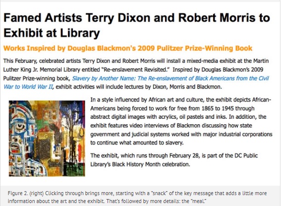
The concept of “bite, snack, meal” came from Marilynne Rudick and Leslie O’Flahavan of the online writer’s resource e-write. For people who have trouble reading, the “bite” may be all they need—if the bite conveys the key message. With a little more effort, they may take in the “snack”—a few sentences or short paragraphs or set of relevant questions and answers. That leaves the “meal” for those who need the details or have the time or stamina or ability to read in depth.
“Bite, snack, meal” fits well with the inverted pyramid style of writing, as well as with the linear style from key message to details that Summers and Summers found works best for low-literacy readers.
2. Show the structure with an informative title, headings, and links
Once you have your messages organised into bite, snack, meal, the next step is to clearly signal that structure to your users using an informative title supported by good headings and links.
On the web, cute titles don’t work. The title may be all people see as a link. That link has to entice the people who need it to click on it—and not entice people for whom it is not relevant.
One of the authors called one of her columns “Piggy in the Middle.” Who would know that this is about whether to use an even or odd number of response categories in a survey? In hindsight, it’s no surprise that it gets few hits.
Many web users hop from link to link, so make sure that those links are meaningful. Use your site visitors’ words in the links. Don’t use “click here” or “more.” Imagine someone listening to the screen hearing only “click here,” “click here,” or “more,” “read more.” Write “more about [topic]” instead.
3. Break up the information with short sections, paragraphs, lists, and sentences
Long, dense pages are a problem for everyone.
In school, we were all taught that a paragraph has to have at least three sentences. Not so on the web or even in a print article. A one-sentence paragraph may be fine. A question heading with a short answer—even a fragment of an answer—may be fine.
Keep paragraphs and sentences short. It isn’t “dumbing down” to write simply, it’s respecting your low-literacy readers’ needs. It’s respecting how busy your high-literacy readers are.
Lists make information easy to grasp. Numbered lists make instructions obvious and easy to use.
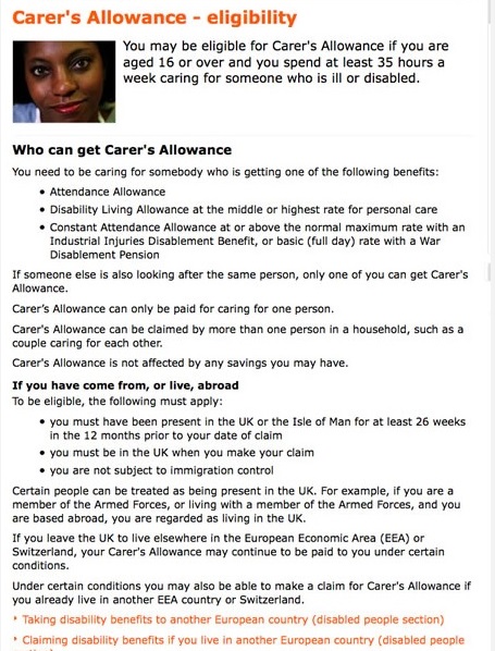
Figure 3 is a page from the site www.direct.gov.uk about who can get government money for taking care of another person.
Figure 3. Part of a web page designed for people to read easily: note the “bite” at the top; clear headings that connect to questions site visitors have; the conversational tone, talking directly to the site visitor; active voice; one-sentence paragraphs; and bulleted lists. This page conveys useful information to people who may not read easily. It does assume that the people reading it know some specific terms like “Attendance Allowance.” That is likely to be true, even for low literacy and second-language readers because if they are coming to this page, they are likely to be involved in a situation where one or more of those named allowances apply. That is, the context they live in, is the context the content refers to.
4. Write in plain language with common words and active verbs
We all read and assimilate the simpler, more common, less abstract words faster. They take up less space. Big words don’t impress; they just make reading more difficult.
Most sentences are about an actor (someone) who creates an action (does or should do something) that affects an object (someone or something else). Active sentences follow the logic of actor—action—object. They tell the story in logical order. Hiding the action in a noun rather than putting it where it belongs (in the verb) makes sentences hard to read.
Example: Passive sentence, hard to read:
“All applications must be filed ahead of the Physical Damage Filing Deadline, 15 June 2010.”
Active verb, a bit easier to read:
“You must file your application ahead of the Physical Damage Filing Deadline, 15 June 2010.”
Common words, active verb, jargon removed, even easier to read:
“You must send us your application before 15 June 2010.”
Research many years ago showed that when readers have to deal with passive sentences with hidden actions they have to spend the mental energy to tell themselves the story—to translate into active, action sentences.
5. Design for visual clarity
As noted earlier, allowing people to adjust the text settings is critical. But most people start with the default setting. If that default is difficult to read, people will simply abandon the page.
The size of the text is only one aspect of the visual design. As you restructure and rewrite your text, you will find that it becomes sharper and more focused. You need to do the same for the surroundings that it sits in.
Ask yourself: is this text standing out clearly from the other elements on the page? Can users focus on the key message, or will they have to try to ignore other visual or text elements on the page that are fighting for their attention?
#designtoread


