The following article, written with Tim Paul, first appeared in UXPA Magazine: Design at scale: Building a design community. It focuses on four design patterns we’d been working on for the GDS Service Manual: dates; display of error messages; gender and sex; form structure.
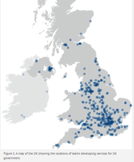
 What happens when your design team expands from a few people in a room to hundreds of people spread across multiple organisations? Is it possible to create consistent experiences for our users when we’re developing a huge variety of different services in dozens of locations?
That’s the challenge we face at the Government Digital Service (GDS), the UK government organisation that’s behind GOV.UK. As we grew, we quickly realised that we’d build better experiences if we created a community of designers who use and contribute to our design advice—and user research helps us to do that.
Revolution not evolution
When the UK Government Digital Service got started in 2011, the goal was one website for the entire national government with a consistent experience for visitors. By the end of 2014, more than 330 government departments and agencies had transitioned their website content to the new single GOV.UK website. That’s a lot of information and it gets a lot of visitors: by the end of August 2015 GOV.UK had approximately 11 million unique visits a week. (You can see the up-to-date data on the Performance Platform.)
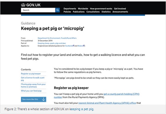
In addition to all that information, there are hundreds of services operated by the central government, from niche topics like registering as a pig keeper of a pet pig (Figure 2)  through high-volume, high importance services like Carer’s Allowance — money paid to someone who provides full-time care without pay to a person with “substantial caring needs” because of disability.
Co-ordinating across departments
GDS has a central support role: we provide infrastructure, tools, and guidance to the colleagues across government who write the content and develop the services.
Our design approach is described in our Service Manual and embodies the philosophy of our Design Principles:
- Start with needs (user needs, not government needs)
- Do less
- Design with data
- Do the hard work to make it simple
- Iterate. Then iterate again.
- This is for everyone
- Understand context
- Build digital services, not websites
- Be consistent, not uniform
- Make things open: it makes things better
The approach is reinforced by our Service Assessment process, where we review services against an 18-point checklist of good practice. If a government department wants funding to transition an existing paper service to a new one that is digital, or to develop something wholly new, it has to work in an iterative way through discovery, alpha, and beta stages — and to pass the appropriate level of service assessment at each stage that releases funds for the next one.
When we were first implementing our design approach in the early days of GDS in 2011, all of the designers easily fit in a room. We simply discussed design challenges as they arose.
By early 2013, GDS had grown. Designers were working in various departments on the first 25 ”exemplar” services that transitioned to GOV.UK, keeping in touch in person and through our email list. That worked, but we also noticed that some topics came up repeatedly.
Since then, the number of designers working across government on our new digital services has grown enormously. We have cross-government design meet-ups approximately every six weeks with 80 or more people at each one—and that’s only the few who are able to get to a specific location on a specific day.
Consistent, not uniform
With all those people working across many locations, how can we ensure that we achieve services that meet our principle of “consistent, not uniform”?
By early 2014, some of the people in our core GDS design and development teams started to think about the challenge of answering the same design questions again and again. They got together to create an ad-hoc project that became our first Design Patterns, GOV.UK Elements, and a prototyping toolkit.
Broadly speaking, the design patterns are independent of technology and help with design questions like “How to ask for a date?” and “How to structure a form?” The GOV.UK elements are more closely tied to coding and help with design questions like “What font can I use?” and “What is the correct color for a link?” The prototyping toolkit is a collection of resources that helps people to quickly make HTML prototypes for GOV.UK.
To find out more about the prototyping toolkit, including links to the kit itself, read How Designers Prototype at GDS.
In this article we’re going to focus on some specific areas of the patterns and elements and give examples of how we use various types of user research and discussion to create them and — in line with our Design Principle 5 — iterate them and iterate again.
A simple pattern: date of birth
Our Date of Birth pattern is an example of one of the ways we make use of user research: we draw on the user research — mostly with the general public as participants — that our colleagues across government do in every sprint as they create services.
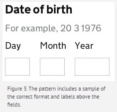
 Many of our services need to ask for date of birth. We based our pattern on research done by the team working on our Register to Vote service. They started with a more familiar pattern with drop-downs for day, month, and year, but discovered that it was hard to use, particularly as the Year box had to go back 115 years. They describe the options that they tried and rejected in Asking for a date of birth.
Based on their research, our current pattern for Date of Birth has three boxes (shown in Figure 3).
We ask colleagues to start their designs with our current patterns, test the patterns as they iterate, and keep us up to date with any problems they find. So far, the “three boxes” pattern for Date of Birth is testing well, and the US Digital Service has recommended a similar pattern for Date of Birth in the first version of their web standards.
Research with people with special needs: error messages
When we do user research with the general public we make sure that we’re testing with people across as wide a range as possible, consistent with our principle 6: This is for everyone. People can choose whether or not to engage with Amazon, Google, or eBay; they can’t choose to go to a different government.
For example, we updated our advice on validation and displaying error messages earlier this year because we discovered that the previous method didn’t work well for people who are using screen readers.
Our current version includes a summary box to inform the user about the message and instructions on how to mark up the errors so that the underlying code plays nicely with screen readers.
Research with colleagues
So far, so familiar: “We rely on user research to help us improve our product,” is an important message for user experience professionals, and that’s what we all do every day isn’t it?
We agree…and we decided that we also needed to think about the users of our advice—the people who build and improve services. So we do user research with them, too. Let’s call them “colleagues” to avoid confusion with the people who use what they create.
We learned that colleagues may describe themselves as designer, developer, product manager, or quite a wide range of other job titles. They include civil servants, contractors, or consultants working in government departments, but many of them work in agencies or suppliers to government. Most are in the UK but not all; we know of people in India, France, the Netherlands, and Poland, and are constantly finding more connections internationally.
Providing usable guidance to colleagues is quite a challenge. Many are highly experienced web professionals who are busy, opinionated, and discriminating. They have to be selective about the advice they see everywhere and what they choose to use, but they may be in their first role within government. Others are civil servants with deep experience of government, but they may be building their first digital service.
It’s obvious, really, but we discovered that we needed to do lots of usability testing of our advice with colleagues.
For example, busy colleagues will cut and paste a pattern or element right into their code. So if we want them to consider and change some part of the pattern, rather than using it exactly as published, we have to make that very clear. That’s why our advice on error messages has instructions to colleagues in it (“Message to alert the user to the problem goes here,”) not an example of a typical message (Figure 4).
Discussion and expert input
Design principle 10 is Make things open: it makes things better.
Early on we decided to create our design patterns in public and keep the discussion as open as possible. We chose to use Hackpad, a web-based wiki that’s free to use and has a minimal sign-on mechanism (click, enter an email address, and you’re in). It’s not absolutely ideal; for example, there’s no alt-text available so we have to manually enter a caption for any included images so that they are accessible for colleagues who use screen readers. But for the moment it seems to be good enough.
We’ve discovered that some colleagues don’t like to discuss things in the open: a civil service culture based on the Official Secrets Act is hard to step away from. So we try to help out by encouraging discussion within our closed lists and then, with their permission, moving edited parts of the discussion to the Hackpad.
Having a public forum has had an unexpected benefit: people with particular expertise, within the UK and internationally, have contributed their thoughts to our work, too. For example, our Pattern on Gender and Sex has benefited from those contributions and challenges from inside and outside government. As with all our patterns, we’re continuing to iterate.
Dealing with complexity
In July 2015, we revised our advice on form structure. You can read more about the changes in No more accordions: how to choose a form structure. We now emphasise a three-step process:
- Know why you’re asking every question
- Design for the most common scenarios first
- Start with one thing per page
Step 1: Investigating every question is definitely in the spirit of design principle 4: Do the hard work to make it simple. Negotiating with stakeholders to consider why they’re asking every single question on a form is absolutely necessary and shows why we’ll always need designers.
Step 2: Design for the most common scenarios first brings our user research colleagues into the process. We have to find our users and make sure we understand the full range of their needs, from most unusual to most typical.
Step 3: Start with one thing per page has been fascinating. Most of us are used to grouping questions into topics and putting several of them on a page; think of the typical e-commerce checkout process with a page about what you’re buying, a page about shipping, and a page for everything to do with payment.
It takes boldness to break up a form into individual questions, put every single one on an individual page, and then allow user research to help you decide whether to regroup them into fewer pages.
Within the UK government, working iteratively with constant user research has become our “new normal”. We know we’ll do lots of iterations so we’re willing to devote a couple of them to focusing on how to group questions into topics.
But what about very complex forms? Some of them have hundreds of questions; others may have dozens of steps, some online and others offline.
Although colleagues are willing to try one thing per page, they’ve pointed out that users need some sort of organising structure. We’re working on that at the moment.
And what about staff, civil servants, and others who have to take action on everything that’s going on? One way of showing staff the data would be to have exactly the same form that users see, but we’ve learned that it’s not helpful for them to click through page after page to find out what’s happening in a particular case. We’ve been working on Design principles for admin interfaces for forms.
Find out more and join our discussions
Our Service Manual includes our design patterns and links to the GOV.UK elements
You can contribute to our design patterns and propose changes.
Some parts of our advice, such as use of our Crown logo, GOV.UK domain names, and New Transport font, is restricted to UK Government. But many of our design patterns and elements can be used by anyone. We’re written about this in one of our blog posts How to use our design patterns – even if your service isn’t part of GOV.UK.
We write about our design work, including the research that informs the design patterns on the GOV.UK design notes blog.
We write about our user research work, including research about research, on the GOV.UK user research blog.
