I live in England, and here Christmas is pretty inescapable. That suits me fine as I love the whole thing: twinkly lights, family get together that’s always exactly the same every year, crazed people rushing through the shops. And so,Continue reading… Books on usability? … not one in a thousand
Category: User research
Not beyond usability – just nearby
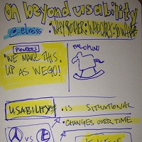
I’ve got a pet peeve: the phrase ‘beyond usability’. It doesn’t matter who uses it and how appropriate it is to the content of their article, website, speech or whatever. I hear it, I get annoyed, I stop paying attention.Continue reading… Not beyond usability – just nearby
Making a better web form
Which usability changes make the biggest difference? Invited by LoanBright to review their forms, we were surprised by some of the results. Among the changes we tested – layout, wording of questions, addition of extra pages – the only one to make a significant differenceContinue reading… Making a better web form
Usability test reports – your chance to influence a new standard
What do you think about international standards such as ISO 13407 or ISO 9000? Necessary but dull? Expensive but important? Irrelevant to daily life? I’m not going to pretend that these documents are ever going to compete with Harry PotterContinue reading… Usability test reports – your chance to influence a new standard
Designing comparative evaluations
It was one of those calls that is simultaneously good news and bad news. “We’d like you to do an evaluation for us. We have two designs here and we want to know which one is better”. The good news:Continue reading… Designing comparative evaluations
Don’t get bitten by JAWS – it deserves respect
A question came up recently on a usability list: how best to test a web application for accessibility. The questioner was new to the field and asked about various points, but the one that resonated with me was this: ‘Finally,Continue reading… Don’t get bitten by JAWS – it deserves respect
A farewell to pop-ups
Comment added in 2022: These days we use the term ‘modal’ instead of ‘pop-up’ and I don’t see as much discussion of pop-up blockers. Otherwise, I think this is still accurate. CJ. Do you remember the olden days onContinue reading… A farewell to pop-ups
Blink, scroll, flicker: three ways to ruin your website (and possibly make it illegal)
A client’s web team were looking sadly at the ‘scrolling news’ feature they were forced to carry on many pages. “We hate it, we want to get rid of it, but we need evidence”. So I’ve done a bit ofContinue reading… Blink, scroll, flicker: three ways to ruin your website (and possibly make it illegal)
It’s time to make a bigger pond
“Very short sessions on usability testing could be bad for the profession”. It was another of those discussions that I have from time to time, where I know that we’re not going to reach an agreement but I’m trying toContinue reading… It’s time to make a bigger pond
Dos and don’ts of web traffic measurement
Last week I was deep into one of my favourite things: brooding on web traffic data. And it got me thinking about the joy of measurement – particularly in the context of making websites easy to use. Usability testing isContinue reading… Dos and don’ts of web traffic measurement


