When you are making a digital form, is it OK to put a hint inside a text box? The short version of my advice: don’t do it! Hint text is rarely effective as a way of helping users, but insteadContinue reading… Don’t put hints inside text boxes in web forms
Category: User research
Designing forms for technical specialists
I had the opportunity to give a talk on forms at the EBI, part of the European Molecular Biology Laboratory (EMBL) – “EBI provides freely available data from life science experiments, performs basic research in computational biology and offers anContinue reading… Designing forms for technical specialists
Search is now normal behaviour – what do we do about that?
What information do visitors search for? What are “good” search results? What are the differences between internal search and external? How do users interact with the Google results page? And what does all of this mean for website design? ReportingContinue reading… Search is now normal behaviour – what do we do about that?
Using measurements to develop complex websites
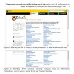
If you are developing a complex website whose users will come to it to carry out complex tasks then you’re likely to want to use a range of data to support your decision-making. This was the situation when I wasContinue reading… Using measurements to develop complex websites
Why we need a ‘qualification brain’
Why we need a ‘qualification brain’: from product catalogue to dominant narrative – enabling web-enquirers to understand and navigate through a flexible but complex curriculum This paper for the 23rd ICDE World Conference on Open Learning and Distance Education, Maastricht,Continue reading… Why we need a ‘qualification brain’
Lessons from Celebrity Chefs: heuristic inspection or user-centred design?
A couple of nights ago, I was watching Heston Blumenthal cooking his ‘Roman Feast’. Blumenthal is a proponent of ‘molecular gastronomy’. His Fat Duck restaurant has been described as the best restaurant in the world, and is famous for itsContinue reading… Lessons from Celebrity Chefs: heuristic inspection or user-centred design?
Culture part 2 – what really matters in designing for different cultures
Recently, culture and design has been a big theme for me. I had the opportunity to travel halfway around the world to Cairns, Australia, to take part in the OzCHI conference – and in particular, the workshop on Inclusivity InteractionContinue reading… Culture part 2 – what really matters in designing for different cultures
Design to read workshop – call for participation
Update, December 2008: this planned workshop was cancelled, and participants joined the “Inclusivity, Interaction Design and Culture” workshop instead Reading is a skill many of us take for granted. We learn at school, practice as adolescents and perfect (or soContinue reading… Design to read workshop – call for participation
Colours and Culture – don’t always believe what you read
The ‘worldwide’ bit of the web made many of us realise that our web designs have the potential to reach the whole world. Some of us work for organisations that explicitly want to attract audiences from many different countries. AndContinue reading… Colours and Culture – don’t always believe what you read
Designing for search: making information easy to find
Today, search is not a design failure, but part of the user experience, one of many ways that people find information on the web. This paper – co-authored with Whitney Quesenbery, Ian Roddis, Sarah Allen and Viki Stirling – looksContinue reading… Designing for search: making information easy to find


