I had the opportunity to give a talk on forms at the EBI, part of the European Molecular Biology Laboratory (EMBL) – “EBI provides freely available data from life science experiments, performs basic research in computational biology and offers anContinue reading… Designing forms for technical specialists
Category: Presentation
Using measurements to develop complex websites
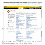
If you are developing a complex website whose users will come to it to carry out complex tasks then you’re likely to want to use a range of data to support your decision-making. This was the situation when I wasContinue reading… Using measurements to develop complex websites
Usable forms
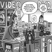
How can we design forms that are easier to read? In this presentation to the Media Trust I highlighted problems in both the ‘conversation’ and ‘appearance’ of some typical forms – and shared tips for improving the experience of users.Continue reading… Usable forms
Why we need a ‘qualification brain’
Why we need a ‘qualification brain’: from product catalogue to dominant narrative – enabling web-enquirers to understand and navigate through a flexible but complex curriculum This paper for the 23rd ICDE World Conference on Open Learning and Distance Education, Maastricht,Continue reading… Why we need a ‘qualification brain’
Where to place labels in forms
Eye-tracking data revealed the good, bad and ugly of forms design, as presented in this talk to UKPA UK – the User Experience Professional Association’s 2009 conference. But the session was also a chance to tackle some of the other controversiesContinue reading… Where to place labels in forms
Search is now normal behaviour. What do we do about that?
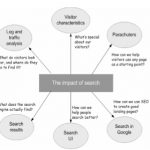
This presentation, co-authored with Whitney Quesenbery, Ian Roddis, Viki Stirling and Sarah Allen, was delivered at UPA 2008 – The Many Faces of User Experience June 16-20,2008, Baltimore, Maryland, USA http://www.usabilityprofessionals.org Exploring the way search affects usability of a site SomeContinue reading… Search is now normal behaviour. What do we do about that?
Expert review helps to improve a complex form
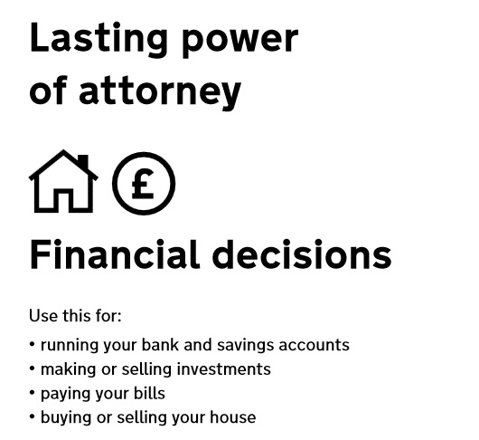
Applying for Lasting power of Attorney is often something people do at a time of challenge or stress. In this presentation to the Sixth International PLAIN Language Conference I describe a case study for the US Department of Constitutional Affairs where ourContinue reading… Expert review helps to improve a complex form
Making a better web form
Which usability changes make the biggest difference? Invited by LoanBright to review their forms, we were surprised by some of the results. Among the changes we tested – layout, wording of questions, addition of extra pages – the only one to make a significant differenceContinue reading… Making a better web form
Making web forms easy to fill in
Introduction and definitions What is a form? BFMA has its own definition, but for this tutorial I am going to propose one that looks at a form from the point of view of the person who fills it in –Continue reading… Making web forms easy to fill in
How to obtain maximum insight by cross-referring site statistics, San Francisco, 2002
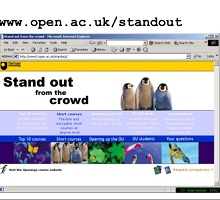
Slides from a presentation to the IIR/IMRO Symposium “Web-based surveys and usability testing”, San Francisco, California, US. The presentation describes a project at the UK’s Open University, which wanted to explore how students make course choice decisions. The students’ motivation,Continue reading… How to obtain maximum insight by cross-referring site statistics, San Francisco, 2002


