Surveys can be a really valuable source of great data. At the 2014 UXPA conference I decided to challenge my audience with a workshop exploring six crucial concepts from survey methodology that will determine how useful that data is: Ask questionsContinue reading… Six crucial survey concepts that UX professionals need to know
Category: Presentation
Looking forward to UXPA 2014
Ahead of UXPA 2014, the Futureheads UX team interviewed me about the sessions I’m running at the conference, and what else I’m looking forward to. On Monday 21 July I’m running an evening tutorial in ‘Surveys in User Experience’. I’m looking forwardContinue reading… Looking forward to UXPA 2014
A deep dive into questions
How to ask better questions, and how to assess user experience using surveys, were the themes of the workshop I ran for UXLX – the 2014 User Experience conference held in Lisbon. We focused on the four key areas forContinue reading… A deep dive into questions
The design of survey forms at GOR 2014
Where does a form end and a survey begin? That was my challenge when I was invited lead a half-day workshop on forms design at the General Online Research conference 2014 in Cologne, Germany. The group included survey methodologists fromContinue reading… The design of survey forms at GOR 2014
Design tips for complex forms, Washington 2013
At the User Experience Professionals Association Conference in Washington in 2013, I returned to the topic of complex forms. I chose the example of applying for a US passport, a typical government process that exposes the challenges of creating a consistentContinue reading… Design tips for complex forms, Washington 2013
Tips for improving your complex forms
Are you working with insurance applications, medical claims or government transactions? This workshop I delivered at UXPA 2013 in Cambridge has tips for improving them. Ideas for design of complex transactions by @cjforms 2013 from Caroline Jarrett View theContinue reading… Tips for improving your complex forms
Better UX surveys for UCD2012
UCD2012 – the User Centred Design Conference in London – was an initiative organised by the Computer Society Interaction Group (BCS), British Interactive Media Association (BIMA), the Institute of Ergonomics and Human Factors (IEHF), Interaction Design Association (IxDA) and the UserContinue reading… Better UX surveys for UCD2012
More investigation of why usability problems go unfixed
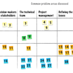
Not enough time, not enough resources, not enough clout to make it happen… Earlier in the year, Steve Krug and I reported on a survey that we carried out amongst UX professionals about why usability problems go unfixed. We suggested some ideasContinue reading… More investigation of why usability problems go unfixed
Write clearly: how to take your writing for the web to the next level
These slides form part of a workshop on writing and editing for the web, delivered for EMBL-EBI in June 2012. Write clearly: take your web writing to the next level from Caroline Jarrett View the slides as aContinue reading… Write clearly: how to take your writing for the web to the next level
Buttons on forms and surveys: a look at some research
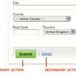
Where to put the buttons on forms? There seem to be endless discussions: Does ‘submit’ or ‘send’ or ‘OK’ go to the left or right of ‘cancel’? Does ‘next’ go to the left or right of ‘previous’? My views are:Continue reading… Buttons on forms and surveys: a look at some research

