How to handle very long field names was the question exercising the expert panel in the May 2014 edition of Ask UXMatters. We came up with a number of suggestions, but before implementing any of them, test with your users.Continue reading… How to deal with long field names
Category: Design
Discussion: Design for Everyone – at the Service Design in Government conference
How do we make our services available to everyone who needs to use them? A group of us at the Service Design in Government 2014 conference came together in a Goldfish Bowl group to talk about our personal and design challenges.Continue reading… Discussion: Design for Everyone – at the Service Design in Government conference
Review – A Web for Everyone: Designing Accessible User Experiences
Some dozen years ago, I had a conversation with a web developer that went like this: Him: “Our website meets WCAG triple A.” Me: “But do you know whether people with disabilities can use it?” Of course, he was rightContinue reading… Review – A Web for Everyone: Designing Accessible User Experiences
Using metrics to help improve a University prospectus
This post, written with Viki Stirling of the Open University, was first published in Tullis, T. and Albert, W. Measuring the User Experience: Collecting, Analyzing, and Presenting Usability Metrics, Morgan Kaufmann/Elsevier 2013. The Open University is the UK’s largest university,Continue reading… Using metrics to help improve a University prospectus
Rhetorical accessibility: at the intersection of technical communication and disability studies
This collection, edited by Lisa Meloncon and just published by Routledge, includes a chapter bringing a more academic spin to the earlier article on designing for accessibility co-authored with Janice (Ginny) Redish, Kathryn Summers and Kath Straub. That article, DesignContinue reading… Rhetorical accessibility: at the intersection of technical communication and disability studies
Design to Read: resources
This post is intended as a round-up of web and other resources that may be helpful when you are designing for people who do not read easily. It was first published on a dedicated Design to Read website. Publications byContinue reading… Design to Read: resources
Don’t put labels inside text boxes
Back in 2010, I wrote: Don’t Put Hints Inside Text Boxes in Web Forms. That was unusual for me because I came straight out and said, “Don’t.” Not “it depends”— just “don’t.” And it generated a lot of discussion—none ofContinue reading… Don’t put labels inside text boxes
How to find out about the usability of your website using a survey
My starting point for a workshop I led at UX Cambridge 2012 was being asked whether a usability test can use only a questionnaire with no observation? This presentation – How to find out about the usability of your website using aContinue reading… How to find out about the usability of your website using a survey
How to ask about user satisfaction in a survey
Surveys often include questions about satisfaction. But what is satisfaction: an emotional response? all about comparisons? And what does it mean for user experience? This article, first published in the November 2012 UXMatters, examines what satisfaction means and how best to handle its complexity in aContinue reading… How to ask about user satisfaction in a survey
More investigation of why usability problems go unfixed
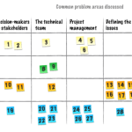
Not enough time, not enough resources, not enough clout to make it happen… Earlier in the year, Steve Krug and I reported on a survey that we carried out amongst UX professionals about why usability problems go unfixed. We suggested some ideasContinue reading… More investigation of why usability problems go unfixed


