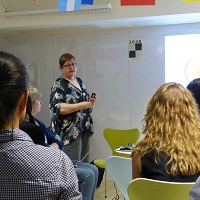
When Tim Paul and I did a session on design patterns at the 2015 Service Design in Government conference in London, we expected to get a lively, interested group of UK central and local government people, and we did. We also metContinue reading… Design patterns aren’t just for government – UX Cambridge 2015
Category: Design
No more accordions: how to choose a form structure
Government forms are usually complex, asking a huge number of questions.What is the best way to group questions to make completing them as easy as possible for people? This blog post for Government Digital Service considers what we’ve learned about form structure fromContinue reading… No more accordions: how to choose a form structure
Book review: “Practical Empathy” by Indi Young
“Voice of the customer”. “Understand user needs”. “Get out of our silos”. “No more group-think”. It’s no longer news that it’s a good idea to understand, respect, and design for other people’s perspectives. And there are plenty of books aroundContinue reading… Book review: “Practical Empathy” by Indi Young
Slides and thoughts on SDinGOV 2015
Service design in government: it’s a technical way of talking about all the ways in which we have to do government things – and how those of us who work in government can improve them. At Service Design in Government 2015, we welcomed keynote speakers JessContinue reading… Slides and thoughts on SDinGOV 2015
How not to get a job, and how to get one
“How can I get a job in user research?” It’s a question that comes up a lot, and reappeared the other day in one of the forums I belong to. It reminded me of a post I wrote a fewContinue reading… How not to get a job, and how to get one
How to look at a form – to learn a lot, quickly
If you look at a form through the eyes of your users then you can learn a lot, very quickly. We tried it recently at a forms studio with Women Who Code London. Don’t look at the form One of theContinue reading… How to look at a form – to learn a lot, quickly
Celebrating inspiring women on Ada Lovelace Day
Women Who Code is the international organisation dedicated to inspiring women to excel in technology careers. I was delighted to be invited to join their London group on Ada Lovelace Day – the annual celebration of a woman widely considered to be the first computer programmer. It gave meContinue reading… Celebrating inspiring women on Ada Lovelace Day
Eye tracking in user experience design: forms and surveys
This chapter, co-authored with Jennifer Romano Bergstrom, is published in Eye Tracking in User Experience Design (2014) Introduction Most parts of a web experience are optional. Forms usually are not. You want to use a web service? Register for it—usingContinue reading… Eye tracking in user experience design: forms and surveys
Looking forward to UXPA 2014
Ahead of UXPA 2014, the Futureheads UX team interviewed me about the sessions I’m running at the conference, and what else I’m looking forward to. On Monday 21 July I’m running an evening tutorial in ‘Surveys in User Experience’. I’m looking forwardContinue reading… Looking forward to UXPA 2014
Lessons from Lisbon in accessible design
One reason I argue so strongly for designing in accessibility for people with special needs is that accessible design is also good design. Watching people explore a model of Lisbon’s Belem Tower – provided for people with visual impairments – wasContinue reading… Lessons from Lisbon in accessible design


