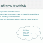
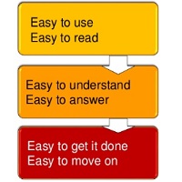
If you’re working on improving a form, especially a government one, what advice do you need? In April 2019, I discussed a topic map that might help to answer that question in a webinar for Digital.GOV. To find out moreContinue reading… Discussing a topic map for how to design a better form
Category: Design
Draft curriculum for ‘How to Design a Form’
Post originally published in 2019; updated in 2022 In March 2019, I was working mostly with the NHS digital standards and redesign team on their advice about patterns. This post: gave the background to the work, explained about the draftContinue reading… Draft curriculum for ‘How to Design a Form’
Endnote at the 2018 Service Design in Government Conference
I was delighted to be asked to do the Endnote at this year’s Service Design in Government Conference, held in Edinburgh 7-9 March. I’d attended the first three #SDinGov events and was disappointed to miss last year’s conference because ofContinue reading… Endnote at the 2018 Service Design in Government Conference
Forms, surveys and the need to be brave: UX Insider interview
I’ve always really enjoyed reading the ‘UX Insider’ interviews conducted by Damian Rees of experienceux. The one with Tara Land about her work at GDS is a particular favourite. So I felt very honoured when Damian contacted me to allow me toContinue reading… Forms, surveys and the need to be brave: UX Insider interview
“Interfaces include people” at SACon 16
Interfaces have always been areas of peril in software development. In this presentation to the 2016 O’Reilly Software Architecture Conference in London, I wanted to challenge teams to include interfaces with people – and maybe even with paper – in their notions of whereContinue reading… “Interfaces include people” at SACon 16
Government services are for people, not for the government
During my recent visit to the Czech Republic, Běla Beránková interviewed me on behalf of Lupa.cz – the country’s internet host. My thanks to Lupa for permission to reproduce the article below, and to Běla for her help with the translation.Continue reading… Government services are for people, not for the government
Honoured by the Cooper Hewitt Smithsonian
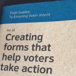
Back in 2012, a Kickstarter launched to create a series of ‘Field Guides for Voter Intent’, some little books to help election officials to create better ballots. Ever since the 2000 ‘Butterfly Ballot’ controversy, this has been a cause I supported soContinue reading… Honoured by the Cooper Hewitt Smithsonian
Designing better public services: LibDesign Conference 2016 Prague
To design better public services, we need to unite efforts from inside and outside the public sector – and many roles within it. LibDesign 2016 in Prague Last week in Prague, LibDesign 2016 brought together librarians, web designers, civil servants and academics toContinue reading… Designing better public services: LibDesign Conference 2016 Prague
The next big thing in user experience – putting people first
In the June 2016 edition, UX Matters asked its expert panel what they see as the next big thing in user experience. Here’s my contribution. User experience seems to go in cycles. When I first started working in what we now callContinue reading… The next big thing in user experience – putting people first
Is reading on the web really different?
Is reading on a web site really different from reading on paper? The answer is: no, not really. We don’t read every word on the web. But we don’t read every word on paper, either. “Reading on the web isContinue reading… Is reading on the web really different?


