Earlier this year, we learned of the bitter legal battles over Terri Schiavo. Her husband and her parents disagreed on whether to continue to give her treatment after she collapsed into a coma seven years ago. Like Terri, I haveContinue reading… Matters of life and death: an investigation of “living wills” and other advance directives
Category: Design
Sentence or title case in ISO-9241:1998
Update in 2025. This article was published in 2005 and reflected the standards available then. ISO 9241:1998 was withdrawn in 2021. Back in the 2000s, we referred a lot more to ISO standards, Twenty years later, we’re more likely toContinue reading… Sentence or title case in ISO-9241:1998
Persona-led heuristic inspection is here
Last week, a sell-out crowd made their way to Oyster Partners to hear Ginny Redish talk about her recent work at a meeting of the UK chapter of the Usability Professionals’ Association. Ginny’s talk ranged widely across content and theContinue reading… Persona-led heuristic inspection is here
User Interface Design and Evaluation: Open University textbook
“User Interface Design and Evaluation” began life as the Open University distance learning course M873, part of the postgraduate diploma. More than 1000 professionals studied the course and the University decided to make the core course materials available as aContinue reading… User Interface Design and Evaluation: Open University textbook
Long forms: scroll or tab?
As some of you will know, I’m pretty much a diehard forms obsessive and there’s nothing I like more than a question about forms – especially if I have some experience or data to support my answer. So I thoughtContinue reading… Long forms: scroll or tab?
“Easy Read” and writing for people with learning disabilities
For a long while now, I’ve been worrying about how to design forms for people with learning disabilities. It’s not been a pressing problem because frankly, a lot of the forms that I work with don’t even work for peopleContinue reading… “Easy Read” and writing for people with learning disabilities
We need to include people with disabilities in our designs
Recently, I was having an online conversation about the challenges of finding participants for testing – specifically, the challenges of finding participants with disabilities. Someone put the view; “if we’re having trouble finding people with disabilities, then maybe we wouldContinue reading… We need to include people with disabilities in our designs
Books on usability? … not one in a thousand
I live in England, and here Christmas is pretty inescapable. That suits me fine as I love the whole thing: twinkly lights, family get together that’s always exactly the same every year, crazed people rushing through the shops. And so,Continue reading… Books on usability? … not one in a thousand
Hooray, I’m Doing the Forms!
Here’s a little secret that I’d like to share with you: most people just aren’t all that thrilled by forms. They don’t like filling them in, they don’t like thinking about them, and they certainly don’t like the idea ofContinue reading… Hooray, I’m Doing the Forms!
Not beyond usability – just nearby
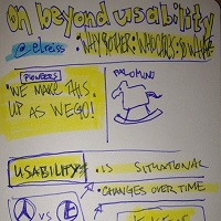
I’ve got a pet peeve: the phrase ‘beyond usability’. It doesn’t matter who uses it and how appropriate it is to the content of their article, website, speech or whatever. I hear it, I get annoyed, I stop paying attention.Continue reading… Not beyond usability – just nearby


