This selection of questions and answers about forms first appeared on the website to accompany my book (with Gerry Gaffney) Forms That Work: designing web forms for usability. We’d thought of calling the section “Frequently Asked Questions” but we thought weContinue reading… Questions about forms
Category: Design
Can I use an asterix to indicate optional fields?
I was asked recently: ‘Our form has many required fields and few optional fields. We think that we should use an asterisk to indicate the optional fields. Do you agree?’ It makes sense but it is also a bad idea.Continue reading… Can I use an asterix to indicate optional fields?
Usable forms
How can we design forms that are easier to read? In this presentation to the Media Trust I highlighted problems in both the ‘conversation’ and ‘appearance’ of some typical forms – and shared tips for improving the experience of users.Continue reading… Usable forms
Why we need a ‘qualification brain’
Why we need a ‘qualification brain’: from product catalogue to dominant narrative – enabling web-enquirers to understand and navigate through a flexible but complex curriculum This paper for the 23rd ICDE World Conference on Open Learning and Distance Education, Maastricht,Continue reading… Why we need a ‘qualification brain’
Lessons from Celebrity Chefs: heuristic inspection or user-centred design?
A couple of nights ago, I was watching Heston Blumenthal cooking his ‘Roman Feast’. Blumenthal is a proponent of ‘molecular gastronomy’. His Fat Duck restaurant has been described as the best restaurant in the world, and is famous for itsContinue reading… Lessons from Celebrity Chefs: heuristic inspection or user-centred design?
Dealing with international addresses
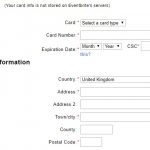
You’re working on an international website. What’s the best way to ask people from all over the world for their addresses?” Useful resources for international addresses Graham Rhind’s free ebook Better data quality from your web form is a thorough and thoughtfulContinue reading… Dealing with international addresses
Where to place labels in forms
Eye-tracking data revealed the good, bad and ugly of forms design, as presented in this talk to UKPA UK – the User Experience Professional Association’s 2009 conference. But the session was also a chance to tackle some of the other controversiesContinue reading… Where to place labels in forms
Designing paper forms
This post was originally posted on Caroline’s Forms That Work website – the companion site to her book with Gerry Gaffney Forms that work: Designing web forms for usability, Morgan Kaufmann/Elsevier, November 2008. We love working with paper forms, butContinue reading… Designing paper forms
Culture part 2 – what really matters in designing for different cultures
Recently, culture and design has been a big theme for me. I had the opportunity to travel halfway around the world to Cairns, Australia, to take part in the OzCHI conference – and in particular, the workshop on Inclusivity InteractionContinue reading… Culture part 2 – what really matters in designing for different cultures
Design to read workshop – call for participation
Update, December 2008: this planned workshop was cancelled, and participants joined the “Inclusivity, Interaction Design and Culture” workshop instead Reading is a skill many of us take for granted. We learn at school, practice as adolescents and perfect (or soContinue reading… Design to read workshop – call for participation


