This presentation, given to the 49th Society for Technical Communication Conference in Nashville, USA, offers an overview of my work with the UK Inland Revenue (now HM Revenue and Customs). It records some our findings on usability, and the changes we made as aContinue reading… Improving usability: case study of Inland Revenue Employer’s Pack
Category: All
Should I use a drop-down? Four steps for choosing form elements on the web
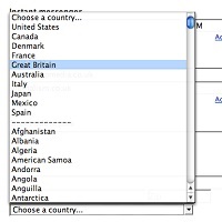
No. Don’t use a drop-down. Updated in 2023. Back in 2001, Sarah Allen and I wrote this paper, and I delivered it at the 48th Society for Technical Communication Conference in Chicago, Illinois. We had done plenty of testing ofContinue reading… Should I use a drop-down? Four steps for choosing form elements on the web
How to set usability requirements for a website containing a form
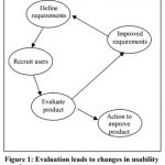
This paper, co-authored with Sarah Allen Miller, was originally presented at the Society for Technical Communication Conference, Chicago, Illinois, 2001. Slightly updated in 2024. If anyone can use our website, how can we define requirements? In traditional systems development, users wereContinue reading… How to set usability requirements for a website containing a form
Why users don’t complain about bad forms
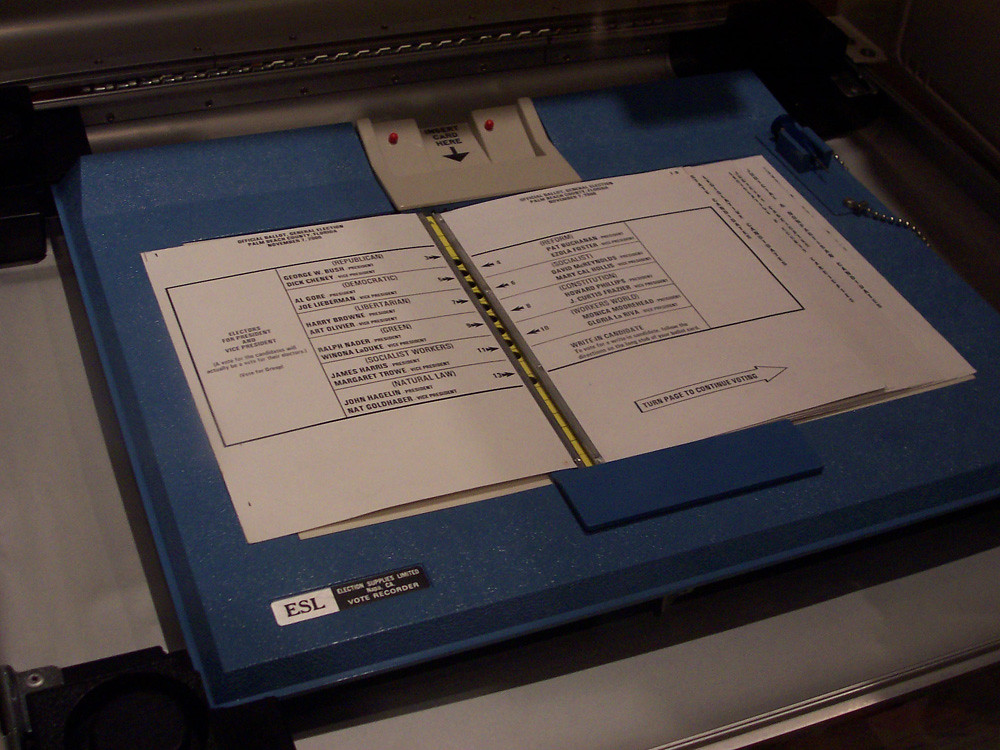
Originally written in response to the Florida vote controversy in the US 2000 presidential election, here are plenty of reasons why you may never know that users are struggling with your form. This article first appeared in January 2001 in UserContinue reading… Why users don’t complain about bad forms
Designing usable forms: the three-layer model of the form
A version of this paper was first delivered at the 47th Society for Technical Communication Conference in Florida. Most people do not enjoy filling in a form If you want to create a usable form, the first step is to understandContinue reading… Designing usable forms: the three-layer model of the form
Understanding the costs of data capture: paper, automatic and with the internet
Organisations have sometimes been surprised and disappointed when they re-engineer a forms-based data capture process but fail to achieve their anticipated savings. This paper, presented to CIMTECH 1999 and 2000, explains: how capture costs are built up from data entryContinue reading… Understanding the costs of data capture: paper, automatic and with the internet
Market research or usability evaluation?
I am a usability consultant and I believe, and find in practice, that usability evaluation is the best way to find out whether a document works for its users. However, I have frequently been in a position where my clientsContinue reading… Market research or usability evaluation?
‘How to’ manual on forms design: guidelines on font size
This paper presents some of the conflicting advice offered to designers on one particular topic in accessibility: the choice of font size for visually impaired people. This creates practical difficulties for designers when trying to apply the advice. It wasContinue reading… ‘How to’ manual on forms design: guidelines on font size
Case study: Improving a paper form for the Open University
A large proportion of the costs of dealing with forms comes from sorting out the mistakes that people make when they fill in the form. Back in 1999, I worked with the Open University on their paper Registration Agreement and associatedContinue reading… Case study: Improving a paper form for the Open University
Changing places: the challenges of boundaries and scalability in the workplace
“Changing Places” was a workshop at Queen Mary and Westfield College, University of London in 1999. Our focus was exploring some of the challenges and successes of online collaboration tools in the workplace – at that time, best known under the acronymContinue reading… Changing places: the challenges of boundaries and scalability in the workplace


