My printer died. It was a Xerox Phaser 8200, a colour printer that uses ‘solid ink’ technology. I liked it a lot because it was quick, high quality, and the solid ink is relatively inexpensive. It had done well forContinue reading… Unethical or merely inept?
Category: All
Two-column forms are best avoided
A concerned designer wrote to me: ‘Our forms are laid out in a single vertical column. A new project manager is pushing to get the forms for a new product to ‘look different from other products’ by requesting a twoContinue reading… Two-column forms are best avoided
Rules for labelling buttons
It was one of those really conscientious discussions that seemed to have no end. First UI designer: ‘Right. Now here we have a tabbed dialogue box. When you press ‘Cancel’, it should remove all the changes the user has doneContinue reading… Rules for labelling buttons
A magazine about psychology?
As I write this, it’s the run up to Christmas and I’ve reached the point where anything now left undone on my to-do list is going to stay that way. So I thought I’d change focus slightly from my normalContinue reading… A magazine about psychology?
Teaching beginners to find usability problems
My sister lives in Melbourne and that naturally makes me want to get to Australia as often as I can. So I was especially pleased when a few things came together and I was able to make it to OzCHI,Continue reading… Teaching beginners to find usability problems
Ticket, please? Thoughts on visibility of system status
We open with a story that’s a touch complicated. Hang in here with me, the usability point will come through in the end. My husband loves his railways. He’s mostly into railways as they actually are today, as a practicalContinue reading… Ticket, please? Thoughts on visibility of system status
What’s News? And what’s not?
Novelty attracts – or so we’re told. If you want to get repeat visitors to your website then you need to be offering them ‘new stuff’ with each visit. Perhaps the popularity of blogs is partly because you’re likely toContinue reading… What’s News? And what’s not?
Registration Forms – what to do if you can’t avoid them
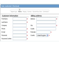
The sad thing about registration forms is that users hate them. Stick a form in front of them and they leave your site, they lie, or if they are really web-savvy they use a privacy protection service such as Bugmenot.Continue reading… Registration Forms – what to do if you can’t avoid them
Matters of life and death: an investigation of “living wills” and other advance directives
Earlier this year, we learned of the bitter legal battles over Terri Schiavo. Her husband and her parents disagreed on whether to continue to give her treatment after she collapsed into a coma seven years ago. Like Terri, I haveContinue reading… Matters of life and death: an investigation of “living wills” and other advance directives
Sentence or title case in ISO-9241:1998
Update in 2025. This article was published in 2005 and reflected the standards available then. ISO 9241:1998 was withdrawn in 2021. Back in the 2000s, we referred a lot more to ISO standards, Twenty years later, we’re more likely toContinue reading… Sentence or title case in ISO-9241:1998


