As a UK-based person often browsing US websites (and sometimes even consulting on the design of them), I’ve noticed that the US and Canada have very predictable phone number formats, as in “123-456-7890”. So it’s relatively easy to program aContinue reading… Formats of telephone numbers – why France and the UK don’t work like the USA
Category: All
Expert review helps to improve a complex form
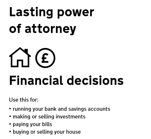
Applying for Lasting power of Attorney is often something people do at a time of challenge or stress. In this presentation to the Sixth International PLAIN Language Conference I describe a case study for the US Department of Constitutional Affairs where ourContinue reading… Expert review helps to improve a complex form
Surveys – what is an acceptable response rate?
It’s been a while since I ranted on about response rates on surveys. In that article, I took the view that “2% is a terrible response rate” and had a few reasons why and tips for doing better. Recently, I’veContinue reading… Surveys – what is an acceptable response rate?
Process or outcome? Measuring the success of usability
How do we measure usability when the start and end points are hard to define, and our work is just one intervention? Maybe real successes come person by person, as attitudes change. A friend has been working with a clientContinue reading… Process or outcome? Measuring the success of usability
Book review: Letting go of the words: by Ginny Redish
This month, I’m enthusing about Ginny Redish’s new book Letting Go of the Words: Writing Web Content that Works (Morgan Kaufmann). If you write, or your clients write, then you’ll learn from it. If you’re working on a content-rich website:Continue reading… Book review: Letting go of the words: by Ginny Redish
Differences between participants and users: representative or not?
‘“Rule 1 for usability testing: get representative users” Read something like that? Said something like that? I certainly have. And I definitely agree with it, on the whole. But not always: so I thought I’d muse on the issue inContinue reading… Differences between participants and users: representative or not?
How to enhance your site with Flash
‘Heard any of these remarks lately? ‘Flash is bad’; ‘I hate Flash intros’; ‘Don’t do Flash’. My long-term view has been that Flash is just another technology. Bad if it’s gratuitous showing off; good if it works for your usersContinue reading… How to enhance your site with Flash
Conducting a User-Centred Expert Review
This presentation to the 2007 Annual Conference of the Society for Technical Communication sets out five steps for a user-centred review – whether you have 30 minutes, two days or five days in which to do the work. We lookContinue reading… Conducting a User-Centred Expert Review
Usability as a legal requirement: leaflets for medicines
At the recent Information Design conference, Karel van der Waarde told us about the impact that European legislation has had on patient information leaflets. These are the pieces of paper that come with every medicine. European Law requires usability InContinue reading… Usability as a legal requirement: leaflets for medicines
How to write good FAQs (Frequently Asked Questions)
Comment in 2025: I wrote this in 2007. Since then, content designers have often pointed out for at least a decade that Frequently Asked Questions (FAQs) are a bad way to meet user needs. Nevertheless, I still find plenty ofContinue reading… How to write good FAQs (Frequently Asked Questions)


