This workshop proposal, co-authored with Kate Grant, William Wong, Nisha Kodagoda and Kathryn Summers, was submitted to the British HCI Group conference in Liverpool, 2008. We were accepted and went on to hold the workshop at the conference. This versionContinue reading… Liverpool 2008 Design to read – workshop proposal
Category: All
Design to read framework: audiences and advice
At the workshop in Liverpool in September 2008, we learned about: some of the reasons why people may find reading difficult some of the guidelines and design approaches we use: our advice Our audiences: reasons why people may find reading difficult In theContinue reading… Design to read framework: audiences and advice
What’s in it for me? Rewarding course evaluators
Everyone likes to be rewarded for their efforts. Course evaluators are no exception. We get asked often to look at new online courses and sometimes even get offered a login name and password to a course that other people wouldContinue reading… What’s in it for me? Rewarding course evaluators
Label placement in forms: what’s best?
Introduction Forms are ubiquitous and a major way in which websites can become interactive. But they tend to receive little design attention – and much of that is spent arguing about details. This talk looks at one of those details:Continue reading… Label placement in forms: what’s best?
Liverpool 2008 Design to Read workshop report
The first Design to Read workshop was held at the British HCI Group conference “HCI2008 Culture, Creativity, Interaction” in Liverpool, UK, on 2nd September 2008. Read the workshop proposal. Why people struggle to read The content of the workshop reflectedContinue reading… Liverpool 2008 Design to Read workshop report
Buttons on forms – where to put them, and what to call them
Here’s a question that I get asked quite often: “Should we put ‘OK’ button to the left or the right of the ‘Cancel’ button?” A common variant is to ask the same question with ‘Back’ or ‘Previous’ instead of ‘Cancel’,Continue reading… Buttons on forms – where to put them, and what to call them
Delivering Better Ballots
“An election is not held to test voters’ ability to follow instructions, but to receive instructions from the voters as to which candidates they will elect. No legitimate public purpose is served by designs that distort those instructions.” It’s goodContinue reading… Delivering Better Ballots
Search is now normal behaviour. What do we do about that?
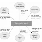
This presentation, co-authored with Whitney Quesenbery, Ian Roddis, Viki Stirling and Sarah Allen, was delivered at UPA 2008 – The Many Faces of User Experience June 16-20,2008, Baltimore, Maryland, USA http://www.usabilityprofessionals.org Exploring the way search affects usability of a site SomeContinue reading… Search is now normal behaviour. What do we do about that?
A whole industry sector’s websites rated according to their usability
Back in March, 2008, Usability News noted the publication of the 10th annual ‘Better Connected’ report. If you work on websites for local government, this won’t have passed you by: Better Connected’s annual assessment is the point each year whenContinue reading… A whole industry sector’s websites rated according to their usability
Usability of content is plain language: the USA Plain Language Act
An exciting thing happened in the USA on 14th April 2008. It didn’t quite manage to make it onto the national news – that day, we were mostly hearing about the Pope’s visit to the United States. Any ideas? Any clueContinue reading… Usability of content is plain language: the USA Plain Language Act


