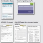
From tax returns to lasting power of attorney, some forms present both designers and users with a huge number of challenges. In this presentation to the 2010 Usability Professionals’ Association Conference, I highlight some of the pitfalls of designing complex forms –Continue reading… Tips for designing complex forms, UPA2010
Category: All
How I got started in forms and usability
These slides are from a presentation I made as part of the Usability Fundamentals Panel at the UPA2010 conference, held in Munich in May. Getting started in forms and usability, UPA Munich 2010 from Caroline Jarrett
Embedded links and online reading accessibility
At the 2010 Society for Technical Communication conference in Dallas, Whitney Quesenbery and I were interviewed about the feasibility of removing links embedded directly within paragraphs. These have been described as “exit points” that confuse and disorient low-literacy readers. The interview wasContinue reading… Embedded links and online reading accessibility
UXLX: Label placement in forms – and other time-consuming controversies
Here’s a look at current research into where to place labels – the text that stands for a question – if you want your forms to be usable. This presentation to the 2010 User Experience Conference in Lisbon also examines someContinue reading… UXLX: Label placement in forms – and other time-consuming controversies
Label placement in forms and other time-consuming forms controversies
A presentation on Label placement in forms, at the Technical Communication Summit, the 56th Annual Conference of the Society for Technical Communication, Dallas, US, May 2010. Amongst the time-consuming controversies we look at are left and right alignment, labels aboveContinue reading… Label placement in forms and other time-consuming forms controversies
Surveys That Work: Using Questionnaires to Gather Useful Data, Seattle 2010
This presentation to the Society for Technical Communication 2010 conference in Seattle, US, compares survey processes and looks at some of the detail of designing surveys – including how to avoid survey error. Surveys That Work: using questionnaires to gatherContinue reading… Surveys That Work: Using Questionnaires to Gather Useful Data, Seattle 2010
Avoid putting a reset button on your web forms
The history of RESET HTML 2.0 appeared in 1995. At that time, I was working in usability of forms – and I still am. But I didn’t have email or an internet connection. So I think it was remarkably niceContinue reading… Avoid putting a reset button on your web forms
Label placement in forms – and other time-consuming controversies
A presentation on label placement in forms, for the Technical Communication Summit in Seattle, April 2010. Amongst the time-consuming controversies we look at are left and right alignment, labels above and below fields, how to handle required fields, colons, andContinue reading… Label placement in forms – and other time-consuming controversies
Don’t put hints inside text boxes in web forms
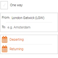
When you are making a digital form, is it OK to put a hint inside a text box? The short version of my advice: don’t do it! Hint text is rarely effective as a way of helping users, but insteadContinue reading… Don’t put hints inside text boxes in web forms
Designing forms for technical specialists
I had the opportunity to give a talk on forms at the EBI, part of the European Molecular Biology Laboratory (EMBL) – “EBI provides freely available data from life science experiments, performs basic research in computational biology and offers anContinue reading… Designing forms for technical specialists

