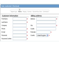
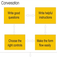
Most design advice is for simple forms. What should we do when the forms are complex? This presentation, delivered to the Associação Portuguesa de Profissionais de Usibilidade, Lisbon, in October 2010, gives a few tips in different areas: relationship, conversation,Continue reading… Design tips for complex forms at APPU
Category: All
Design tips for complex forms, Clarity Conference
This presentation to the Clarity Conference in Lisbon gives some ideas for how to improve difficult, lengthy forms. Complex forms at Clarity2010 from Caroline Jarrett #forms ‘formsthatwork
Usability – and what usability means for a form
Thanks to KANA Europe for inviting me to join their customer conference. This was the presentation I gave, on usability and forms. Usability and forms, KANA Europe customer summit from Caroline Jarrett #forms #formsthatwork #usability
Label placement in Austrian forms, with some lessons for English forms
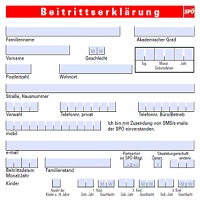
Here’s a topic that divides UX professionals from ordinary people: label placement in forms. UX professionals get all excited about it, and I plead guilty to joining the discussion. I’ve written about it, included it in my book Forms ThatContinue reading… Label placement in Austrian forms, with some lessons for English forms
Form assessment toolkit: a step in the right direction but misses the real issues
Records are crucial for government. Neil MacGregor, in his radio series A history of the world in 100 objects chose a government record – a Mesopotamian clay tablet – to describe the origin of writing, and explained that writing wasContinue reading… Form assessment toolkit: a step in the right direction but misses the real issues
Designing usable online forms
Designing usable online forms was a discussion group I led at ‘Building the Perfect Council Website’, a Headstar and Socitm Better Connected conference. Designing usable online forms BCPW10 from Caroline Jarrett #forms #formsthatwork
Design to read: guidelines for people who do not read easily
These guidelines are co-authored by Janice (Ginny) Redish, Kathryn Summers, and Caroline Jarrett. Orignally published in the June 2010 issue of UXPA User Experience, our work orginated in the ‘Design to Read’ project. Design to read project archive This articleContinue reading… Design to read: guidelines for people who do not read easily
Online forms: saving work or causing stress?
E-forms have benefits, but so do paper forms. To have a successful e-forms project, you need to choose the appropriate level of e-form. This 2010 talk to the International Professional Communication Conference also describes several indicators of e-forms project success.Continue reading… Online forms: saving work or causing stress?
The question protocol: how to make sure every form field is necessary
What is a question protocol? A question protocol is a tool for finding out which form fields are required. It lists: every question you ask who within your organisation uses the answers to each question what they use them forContinue reading… The question protocol: how to make sure every form field is necessary


