Caroline welcomes Jane There’s nothing like a Big Birthday to focus the mind on what happens next. Looking back over 20 years of my business Effortmark, I realised that I wanted to do better in future about keeping track of whatContinue reading… Jane Matthews joins Effortmark
Category: All
A deep dive into questions
How to ask better questions, and how to assess user experience using surveys, were the themes of the workshop I ran for UXLX – the 2014 User Experience conference held in Lisbon. We focused on the four key areas forContinue reading… A deep dive into questions
Discussion: Design for Everyone – at the Service Design in Government conference
How do we make our services available to everyone who needs to use them? A group of us at the Service Design in Government 2014 conference came together in a Goldfish Bowl group to talk about our personal and design challenges.Continue reading… Discussion: Design for Everyone – at the Service Design in Government conference
Book review: A Web for Everyone: Designing Accessible User Experiences
Some dozen years ago, I had a conversation with a web developer that went like this: Him: “Our website meets WCAG triple A.” Me: “But do you know whether people with disabilities can use it?” Of course, he was rightContinue reading… Book review: A Web for Everyone: Designing Accessible User Experiences
Effortmark: better forms and surveys for 20 years
Is it really 20 years since I set up Effortmark? 1994 seems both a long time ago, and very recent. Some things have changed: these days, we talk about ‘design thinking’, ‘service design’, ‘user experience’. Then, it was ‘customer focus’,Continue reading… Effortmark: better forms and surveys for 20 years
Eye Tracking in User Experience Design
Eye tracking can be a valuable tool in understanding how users are interacting with forms and surveys – in order to improve them. It’s a topic I’ve presented on many times, such as in this presentation on Visual Forms to the UKContinue reading… Eye Tracking in User Experience Design
Fun with forms
I admit it: most forms are designed with some serious purpose in mind. But I rejoice when I come across a bit of forms humour. Oatmeal describes how to do a shopping cart This cartoon from the Oatmeal is full of good advice –Continue reading… Fun with forms
The design of survey forms at GOR 2014
Where does a form end and a survey begin? That was my challenge when I was invited lead a half-day workshop on forms design at the General Online Research conference 2014 in Cologne, Germany. The group included survey methodologists fromContinue reading… The design of survey forms at GOR 2014
Using metrics to help improve a University prospectus
This post, written with Viki Stirling of the Open University, was first published in Tullis, T. and Albert, W. Measuring the User Experience: Collecting, Analyzing, and Presenting Usability Metrics, Morgan Kaufmann/Elsevier 2013. The Open University is the UK’s largest university,Continue reading… Using metrics to help improve a University prospectus
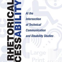
Rhetorical accessibility: at the intersection of technical communication and disability studies
This collection, edited by Lisa Meloncon and just published by Routledge, includes a chapter bringing a more academic spin to the earlier article on designing for accessibility, co-authored with Janice (Ginny) Redish, Kathryn Summers and Kath Straub. That article, DesignContinue reading… Rhetorical accessibility: at the intersection of technical communication and disability studies


