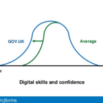
How can we design at scale? That’s the challenge that I’m working on with Tim Paul at the Government Digital Service. When Tim first started working at GDS, the designers could fit into a room and sharing was easy. Now we’veContinue reading… Design patterns in government – 2016
Category: All
Forms workshop for ConCon Manchester 2016
This forms workshop was my first opportunity to contribute to ConCon – a conference for content designers from across government. The differing perspectives of content designers working on GOV.UK and those working within services generated lively discussion during my forms workshop and throughout the conference.Continue reading… Forms workshop for ConCon Manchester 2016
Journey maps: pitfalls and possibilities
At UXPA 2016, I took part in a panel on journey maps. I talked about some of the benefits of journey maps – but also about some of their limitations. Journey maps: pitfalls and possibilities from Caroline Jarrett View the presentation asContinue reading… Journey maps: pitfalls and possibilities
Testing documents: a meeting of Clarity International London
Thanks to the generosity of the City Remembrancer’s office in the City of London, I had the unusual privilege of leading a workshop about testing documents at The City Centre, their meeting venue by the Guildhall. The meeting was one ofContinue reading… Testing documents: a meeting of Clarity International London
Design at scale: building a design community
The following article, written with Tim Paul, first appeared in UXPA Magazine: Design at scale: Building a design community. It focuses on four design patterns we’d been working on for the GDS Service Manual: dates; display of error messages; gender andContinue reading… Design at scale: building a design community
Seminar on teaching Total Survey Error, Auckland
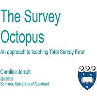
My trip to New Zealand ended on a high note, with an invitation from Beryl Plimmer to visit the University of Auckland Computer Science department for a seminar: “The Survey Octopus: An approach to teaching Total Survey Error”. Thanks to Simone LinzContinue reading… Seminar on teaching Total Survey Error, Auckland
Creating forms that help voters take action
The Field Guide Series aims to equip local election officials in the US with the information they need to ensure voters are able to vote as they intend. It was a privilege to be involved in this Center for CivicContinue reading… Creating forms that help voters take action
Designing forms that work: UX Australia workshop
Thanks again to the UX people in Melbourne and Sydney who came to our UX Australia workshops on “Designing forms that work”, and to Donna Spencer for organising them. I started us off with an introduction to thinking about forms. Continue reading… Designing forms that work: UX Australia workshop
Because the light bulb has to want to change
Sometime in 2011, Steve Krug and I were chatting about a puzzling challenge in usability: the agreed but unfixed problem. ‘Agreed problems’ are ones that clients are fully aware of and agree need to be fixed. ‘Unfixed problems’ are onesContinue reading… Because the light bulb has to want to change
Making presentations accessible
“Could you make sure my older presentations are fully accessible?” Caroline’s request seemed an easy enough task: we’re both keen to ensure that we reach the widest possible audience. Armed with an early version of Whitney Quesenbery’s tips on accessibleContinue reading… Making presentations accessible

