Introduction and definitions What is a form? BFMA has its own definition, but for this tutorial I am going to propose one that looks at a form from the point of view of the person who fills it in –Continue reading… Making web forms easy to fill in
Blog
Back-to-front and inside-out estimating of testing
How to estimate the time needed for a usability test? One of my favourite lists was discussing this recently. Formulae were proposed, variables discussed, and weighting factors considered. I was torn somewhere between a wry smile and an attack ofContinue reading… Back-to-front and inside-out estimating of testing
Getting the video to talk to the audio
The call from the client was “Can we borrow your camera? We’ve only got one, and we need two for the next test”. We agreed a modest fee and the deal was done. Or was it? Close questioning revealed thatContinue reading… Getting the video to talk to the audio
How to obtain maximum insight by cross-referring site statistics, San Francisco, 2002
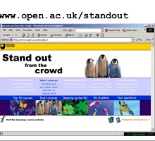
Slides from a presentation to the IIR/IMRO Symposium “Web-based surveys and usability testing”, San Francisco, California, US. The presentation describes a project at the UK’s Open University, which wanted to explore how students make course choice decisions. The students’ motivation,Continue reading… How to obtain maximum insight by cross-referring site statistics, San Francisco, 2002
Improving usability: case study of Inland Revenue Employer’s Pack
This presentation, given to the 49th Society for Technical Communication Conference in Nashville, USA, offers an overview of my work with the UK Inland Revenue (now HM Revenue and Customs). It records some our findings on usability, and the changes we made as aContinue reading… Improving usability: case study of Inland Revenue Employer’s Pack
Should I use a drop-down? Four steps for choosing form elements on the web
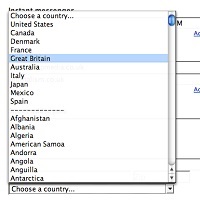
No. Don’t use a drop-down. Updated in 2023. Back in 2001, Sarah Allen and I wrote this paper, and I delivered it at the 48th Society for Technical Communication Conference in Chicago, Illinois. We had done plenty of testing ofContinue reading… Should I use a drop-down? Four steps for choosing form elements on the web
How to set usability requirements for a website containing a form
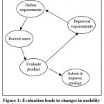
This paper, co-authored with Sarah Allen Miller, was originally presented at the Society for Technical Communication Conference, Chicago, Illinois, 2001. Slightly updated in 2024. If anyone can use our website, how can we define requirements? In traditional systems development, users wereContinue reading… How to set usability requirements for a website containing a form
Why users don’t complain about bad forms
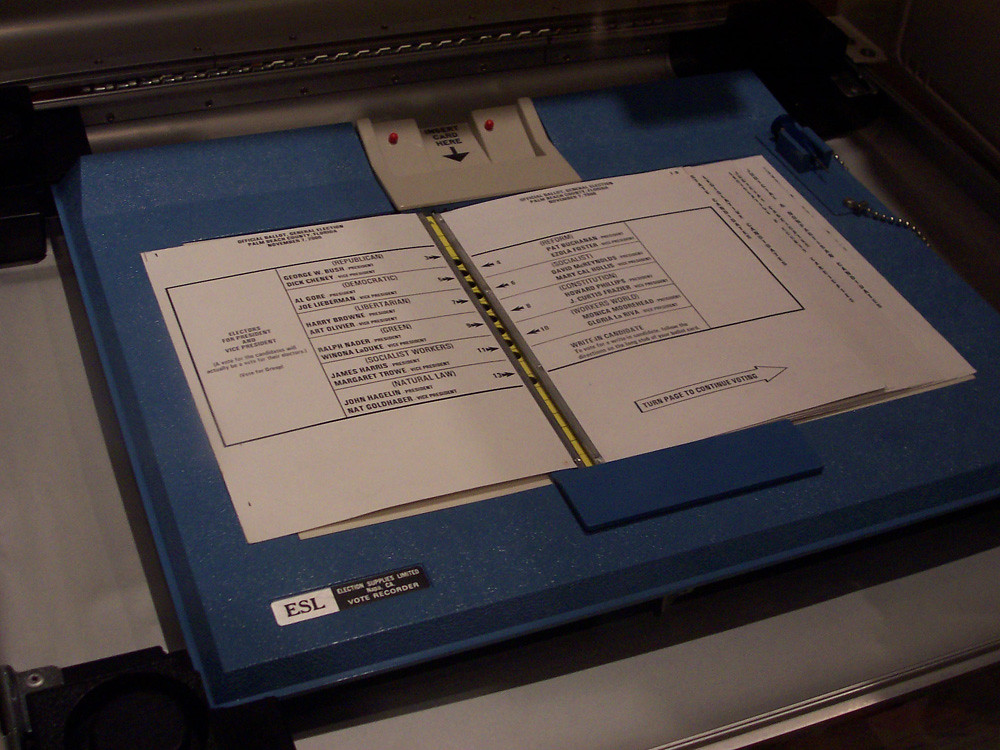
Originally written in response to the Florida vote controversy in the US 2000 presidential election, here are plenty of reasons why you may never know that users are struggling with your form. This article first appeared in January 2001 in UserContinue reading… Why users don’t complain about bad forms
Designing usable forms: the three-layer model of the form
A version of this paper was first delivered at the 47th Society for Technical Communication Conference in Florida. If you want to create a usable form, it helps to understand the three layers: appearance – what people see when theyContinue reading… Designing usable forms: the three-layer model of the form
Understanding the costs of data capture: paper, automatic and with the internet
Organisations have sometimes been surprised and disappointed when they re-engineer a forms-based data capture process but fail to achieve their anticipated savings. This paper, presented to CIMTECH 1999 and 2000, explains: how capture costs are built up from data entryContinue reading… Understanding the costs of data capture: paper, automatic and with the internet

