My trip to New Zealand ended on a high note, with an invitation from Beryl Plimmer to visit the University of Auckland Computer Science department for a seminar: “The Survey Octopus: An approach to teaching Total Survey Error”. Thanks to Simone LinzContinue reading… Seminar on teaching Total Survey Error, Auckland
Blog
Creating forms that help voters take action
The Field Guide Series aims to equip local election officials in the US with the information they need to ensure voters are able to vote as they intend. It was a privilege to be involved in this Center for CivicContinue reading… Creating forms that help voters take action
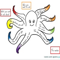
Getting valid results from surveys: meet the Survey Octopus
Surveys are a powerful research method, but not easy to get right. The Survey Octopus is a way of thinking through the issues that will ensure that you’ll get solid results from your survey that you can use to makeContinue reading… Getting valid results from surveys: meet the Survey Octopus
A community, not a library: design patterns for government services
This workshop at UX New Zealand 2015 was a chance for me to lead a discussion on design patterns and forms elements for the UK government website GOV.UK. Looking at our experiences within the UK Government Digital Service #gdsteam theContinue reading… A community, not a library: design patterns for government services
Designing forms that work: UX Australia workshop
Thanks again to the UX people in Melbourne and Sydney who came to our UX Australia workshops on “Designing forms that work”, and to Donna Spencer for organising them. I started us off with an introduction to thinking about forms. Continue reading… Designing forms that work: UX Australia workshop
Because the light bulb has to want to change
Sometime in 2011, Steve Krug and I were chatting about a puzzling challenge in usability: the agreed but unfixed problem. ‘Agreed problems’ are ones that clients are fully aware of and agree need to be fixed. ‘Unfixed problems’ are onesContinue reading… Because the light bulb has to want to change
Making presentations accessible
“Could you make sure my older presentations are fully accessible?” Caroline’s request seemed an easy enough task: we’re both keen to ensure that we reach the widest possible audience. Armed with an early version of Whitney Quesenbery’s tips on accessibleContinue reading… Making presentations accessible
Total Survey Error for non-specialists, Baltimore 2015
Total Survey Error (TSE) is a crucial concept in survey methodology, but one that I’ve struggled to get my head around myself. Eventually I realised that although the issues in TSE are often presented as linear flows, they are actually allContinue reading… Total Survey Error for non-specialists, Baltimore 2015
My new favourite form. Really.
I have a new favourite form: HMRC’s Pay your self-assessment online. Enjoy! But maybe before you do, you’d like a little explanation? OK, I’ll back up a bit and explain. Making better forms isn’t easy I’m a forms specialist –Continue reading… My new favourite form. Really.
Design patterns aren’t just for government – UX Cambridge 2015
When Tim Paul and I did a session on design patterns at the 2015 Service Design in Government conference in London, we expected to get a lively, interested group of UK central and local government people, and we did. We also metContinue reading… Design patterns aren’t just for government – UX Cambridge 2015


