The UK government now has several hundred designers working on services for citizens. How do we design at scale? This presentation to UXPA’s 2016 conference in Seattle describes some of methods and tools we are using to collaborate. Design Patterns for GovernmentContinue reading… Design patterns for government: a community not a library
Blog
Write clearly: take your web writing to the next level 2016
These slides, setting out a series of rules for producing clear and effective web writing, come from a workshop delivered to staff of EMBL/EBI in May 2016. Write Clearly: take your web writing to the next level, May 2016 fromContinue reading… Write clearly: take your web writing to the next level 2016
Interfaces include people
Interfaces have always been areas of peril in software development. In this presentation to the Continuous Lifecycle London conference, I argue that If you’re delivering software that has to be used by real people, you need to distinguish between software thatContinue reading… Interfaces include people
How to look at a form, Industryconf 2016
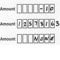
Forms – the only non-optional part of most user experiences, but often the part that gets the least attention. My session at the 2016 Industry Conf in Newcastle was an opportunity to lead the audience through the design of typical formsContinue reading… How to look at a form, Industryconf 2016
The Survey Octopus – getting valid data from surveys
Surveys are a powerful research method, but not easy to get right. The Survey Octopus is a way of thinking through the issues that will ensure that you’ll get solid results from your survey that you can use to makeContinue reading… The Survey Octopus – getting valid data from surveys
Design patterns in government – 2016
How can we design at scale? That’s the challenge that I’m working on with Tim Paul at the Government Digital Service. When Tim first started working at GDS, the designers could fit into a room and sharing was easy. Now we’veContinue reading… Design patterns in government – 2016
Forms workshop for ConCon Manchester 2016
This forms workshop was my first opportunity to contribute to ConCon – a conference for content designers from across government. The differing perspectives of content designers working on GOV.UK and those working within services generated lively discussion during my forms workshop and throughout the conference.Continue reading… Forms workshop for ConCon Manchester 2016
Journey maps: pitfalls and possibilities
At UXPA 2016, I took part in a panel on journey maps. I talked about some of the benefits of journey maps – but also about some of their limitations. Journey maps: pitfalls and possibilities from Caroline Jarrett #usability #user research
Testing documents: a meeting of Clarity International London
Thanks to the generosity of the City Remembrancer’s office in the City of London, I had the unusual privilege of leading a workshop about testing documents at The City Centre, their meeting venue by the Guildhall. The meeting was one ofContinue reading… Testing documents: a meeting of Clarity International London
Design at scale: building a design community
The following article, written with Tim Paul, first appeared in UXPA Magazine: Design at scale: Building a design community. It focuses on four design patterns we’d been working on for the GDS Service Manual: dates; display of error messages; gender andContinue reading… Design at scale: building a design community

