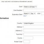
I was asked recently: ‘Our form has many required fields and few optional fields. We think that we should use an asterisk to indicate the optional fields. Do you agree?’ It makes sense but it is also a bad idea.Continue reading… Can I use an asterix to indicate optional fields?
Author: Jane Matthews
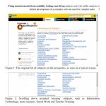
Using measurements to develop complex websites
If you are developing a complex website whose users will come to it to carry out complex tasks then you’re likely to want to use a range of data to support your decision-making. This was the situation when I wasContinue reading… Using measurements to develop complex websites
Usable forms
How can we design forms that are easier to read? In this presentation to the Media Trust I highlighted problems in both the ‘conversation’ and ‘appearance’ of some typical forms – and shared tips for improving the experience of users.Continue reading… Usable forms
Why we need a ‘qualification brain’
Why we need a ‘qualification brain’: from product catalogue to dominant narrative – enabling web-enquirers to understand and navigate through a flexible but complex curriculum This paper for the 23rd ICDE World Conference on Open Learning and Distance Education, Maastricht,Continue reading… Why we need a ‘qualification brain’
How to get a job in usability
As I write, it’s the height of summer here in the UK. The solstice has brought long, perfect days and a new crop of recent graduates, judging by the ‘can I have a job’ emails that I’m starting to get.Continue reading… How to get a job in usability
Tom Johnson interviews Caroline about her new book, Forms that Work
In this podcast for Tom’s blog, I’d Rather Be Writing, I get to talk about my new book, Forms that Work: Designing Web Forms for Usability, co-authored with Gerry Gaffney. We discuss the perceived value users must feel in order to partContinue reading… Tom Johnson interviews Caroline about her new book, Forms that Work
Progressive disclosure: valid or sneaky?
Gianpiero (@gpiero on Twitter) asked: “What do you feel about progressive disclosure in forms? Valid or sneaky (considering you’re probably hiding a lot of fields)?” I’m a huge fan of progressive disclosure, provided it’s used in an honest way. Let meContinue reading… Progressive disclosure: valid or sneaky?
Statistically significant usability testing
It was an intriguing question: “How do I find out about statistically significant usability testing?”. I’m sure it’s one that you’ve encountered, and maybe your reaction was the same as mine: “That’s the wrong question”. Then I realised that ifContinue reading… Statistically significant usability testing
Lessons from Celebrity Chefs: heuristic inspection or user-centred design?
A couple of nights ago, I was watching Heston Blumenthal cooking his ‘Roman Feast’. Blumenthal is a proponent of ‘molecular gastronomy’. His Fat Duck restaurant has been described as the best restaurant in the world, and is famous for itsContinue reading… Lessons from Celebrity Chefs: heuristic inspection or user-centred design?
Dealing with international addresses
You’re working on an international website. What’s the best way to ask people from all over the world for their addresses?” Useful resources for international addresses Graham Rhind’s free ebook Better data quality from your web form is a thorough and thoughtfulContinue reading… Dealing with international addresses

