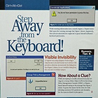
Put a person and a computer together, and you have the possibility of an error. Put two computers together: more possibilities for error. People make mistakes and computers do unexpected things. We try to design out the errors as muchContinue reading… Avoid being embarrassed by your error messages
Author: Jane Matthews
Designing usable online forms
Designing usable online forms was a discussion group I led at ‘Building the Perfect Council Website’, a Headstar and Socitm Better Connected conference. Designing usable online forms BCPW10 from Caroline Jarrett #forms #formsthatwork
Online forms: saving work or causing stress?
E-forms have benefits, but so do paper forms. To have a successful e-forms project, you need to choose the appropriate level of e-form. This 2010 talk to the International Professional Communication Conference also describes several indicators of e-forms project success.Continue reading… Online forms: saving work or causing stress?
Tips for designing complex forms, UPA2010
From tax returns to lasting power of attorney, some forms present both designers and users with a huge number of challenges. In this presentation to the 2010 Usability Professionals’ Association Conference, I highlight some of the pitfalls of designing complex forms –Continue reading… Tips for designing complex forms, UPA2010
How I got started in forms and usability
These slides are from a presentation I made as part of the Usability Fundamentals Panel at the UPA2010 conference, held in Munich in May. Getting started in forms and usability, UPA Munich 2010 from Caroline Jarrett
Embedded links and online reading accessibility
At the 2010 Society for Technical Communication conference in Dallas, Whitney Quesenbery and I were interviewed about the feasibility of removing links embedded directly within paragraphs. These have been described as “exit points” that confuse and disorient low-literacy readers. The interview wasContinue reading… Embedded links and online reading accessibility
Label placement in forms and other time-consuming forms controversies
A presentation on Label placement in forms, at the Technical Communication Summit, the 56th Annual Conference of the Society for Technical Communication, Dallas, US, May 2010. Amongst the time-consuming controversies we look at are left and right alignment, labels aboveContinue reading… Label placement in forms and other time-consuming forms controversies
Avoid putting a reset button on your web forms
The history of RESET HTML 2.0 appeared in 1995. At that time, I was working in usability of forms – and I still am. But I didn’t have email or an internet connection. So I think it was remarkably niceContinue reading… Avoid putting a reset button on your web forms
Label placement in forms – and other time-consuming controversies
A presentation on label placement in forms, for the Technical Communication Summit in Seattle, April 2010. Amongst the time-consuming controversies we look at are left and right alignment, labels above and below fields, how to handle required fields, colons, andContinue reading… Label placement in forms – and other time-consuming controversies
Search is now normal behaviour – what do we do about that?
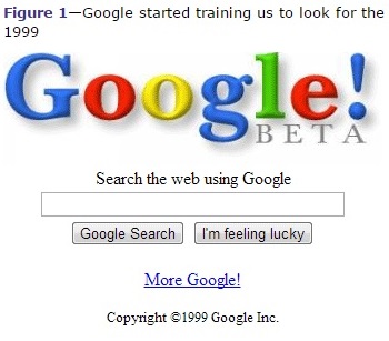
What information do visitors search for? What are “good” search results? What are the differences between internal search and external? How do users interact with the Google results page? And what does all of this mean for website design? ReportingContinue reading… Search is now normal behaviour – what do we do about that?

