The first Design to Read workshop was held at the British HCI Group conference “HCI2008 Culture, Creativity, Interaction” in Liverpool, UK, on 2nd September 2008. Read the workshop proposal. Why people struggle to read The content of the workshop reflectedContinue reading… Liverpool 2008 Design to Read workshop report
Author: Jane Matthews
Buttons on forms – where to put them, and what to call them
Here’s a question that I get asked quite often: “Should we put ‘OK’ button to the left or the right of the ‘Cancel’ button?” A common variant is to ask the same question with ‘Back’ or ‘Previous’ instead of ‘Cancel’,Continue reading… Buttons on forms – where to put them, and what to call them
Search is now normal behaviour. What do we do about that?
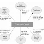
This presentation, co-authored with Whitney Quesenbery, Ian Roddis, Viki Stirling and Sarah Allen, was delivered at UPA 2008 – The Many Faces of User Experience June 16-20,2008, Baltimore, Maryland, USA http://www.usabilityprofessionals.org Exploring the way search affects usability of a site SomeContinue reading… Search is now normal behaviour. What do we do about that?
A whole industry sector’s websites rated according to their usability
Back in March, 2008, Usability News noted the publication of the 10th annual ‘Better Connected’ report. If you work on websites for local government, this won’t have passed you by: Better Connected’s annual assessment is the point each year whenContinue reading… A whole industry sector’s websites rated according to their usability
How to do ‘Contact Us’ badly (and some tips for doing it well)
My email started playing up. I noticed that I was getting items out of sequence, sometimes very late. I tried the usual things: clearing the spam folders, powering the computer down, you know. But there was nothing for it: I’dContinue reading… How to do ‘Contact Us’ badly (and some tips for doing it well)
When more data really isn’t the issue
A few years ago, a rather dull conference speaker spoke one phrase that stuck in my mind. He said: “I was at this meeting, and I heard a voice going ‘blah blah blah’. And then I realised: it was me”.Continue reading… When more data really isn’t the issue
Problems and joys of reading research papers
Most of us are familiar with what it is to read a research paper and, at times, to struggle with it. Writing an editorial for the Journal of Usability Studies, I took my own experience as a user and readerContinue reading… Problems and joys of reading research papers
Adding fun and engagement to purposeful systems using augmented reality and other techniques: report from OzCHI 2007
A warm Australian November, a friendly, collaborative conference: what’s not to like? OzCHI always attracts a proportion of Scandinavians and Brits who are happy to escape to the sun. And to add to the attraction, the theme of OzCHI 2007Continue reading… Adding fun and engagement to purposeful systems using augmented reality and other techniques: report from OzCHI 2007
Formats of telephone numbers – why France and the UK don’t work like the USA
As a UK-based person often browsing US websites (and sometimes even consulting on the design of them), I’ve noticed that the US and Canada have very predictable phone number formats, as in “123-456-7890”. So it’s relatively easy to program aContinue reading… Formats of telephone numbers – why France and the UK don’t work like the USA
Expert review helps to improve a complex form
Applying for Lasting power of Attorney is often something people do at a time of challenge or stress. In this presentation to the Sixth International PLAIN Language Conference I describe a case study for the US Department of Constitutional Affairs where ourContinue reading… Expert review helps to improve a complex form

