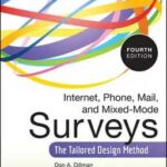
Before I ever considered writing a book on surveys myself, I tried my best to read as much as I could about how people respond to being asked questions – a topic that is central to designing better forms too.Continue reading… Book review: Internet, Mail, and Mixed-Mode Surveys: The Tailored Design Method
Author: Caroline Jarrett
Top five books about forms design – 2010
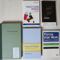
Added note in 2025: It’s still possible to find all these books. I’ve updated the links to them and put a bit of context into them. It’s December, and we’re coming up to the gift-giving season. In case you wantContinue reading… Top five books about forms design – 2010
Form assessment toolkit: a step in the right direction but misses the real issues
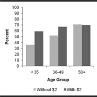
Records are crucial for government. Neil MacGregor, in his radio series A history of the world in 100 objects chose a government record – a Mesopotamian clay tablet – to describe the origin of writing, and explained that writing wasContinue reading… Form assessment toolkit: a step in the right direction but misses the real issues
Design to read: guidelines for people who do not read easily
These guidelines are co-authored by Janice (Ginny) Redish, Kathryn Summers, and Caroline Jarrett. Orignally published in the June 2010 issue of UXPA User Experience, our work originated in the ‘Design to Read’ project. Design to read project archive This article onContinue reading… Design to read: guidelines for people who do not read easily
The question protocol: how to make sure every form field is necessary
What is a question protocol? A question protocol is a tool for finding out which form fields are required. It lists: every question you ask who within your organisation uses the answers to each question what they use them forContinue reading… The question protocol: how to make sure every form field is necessary
UXLX: Label placement in forms – and other time-consuming controversies
Here’s a look at current research into where to place labels – the text that stands for a question – if you want your forms to be usable. This presentation to the 2010 User Experience Conference in Lisbon also examines someContinue reading… UXLX: Label placement in forms – and other time-consuming controversies
Surveys That Work: Using Questionnaires to Gather Useful Data, Seattle 2010
This presentation to the Society for Technical Communication 2010 conference in Seattle, US, compares survey processes and looks at some of the detail of designing surveys – including how to avoid survey error. Surveys That Work: using questionnaires toContinue reading… Surveys That Work: Using Questionnaires to Gather Useful Data, Seattle 2010
Don’t put hints inside text boxes in web forms
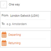
When you are making a digital form, is it OK to put a hint inside a text box? The short version of my advice: don’t do it! Hint text is rarely effective as a way of helping users, but insteadContinue reading… Don’t put hints inside text boxes in web forms
Designing forms for technical specialists
I had the opportunity to give a talk on forms at the EBI, part of the European Molecular Biology Laboratory (EMBL). “EBI provides freely available data from life science experiments, performs basic research in computational biology and offers an extensiveContinue reading… Designing forms for technical specialists


