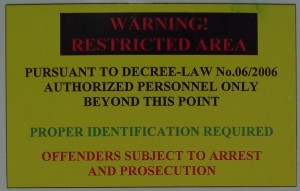
The other day I was trying to persuade someone to kill off a paragraph of the purest, most incomprehensible gobbledegook. Although she agreed that there was no merit in the paragraph, she rejected my suggestion with that depressing but common excuse “We’ll never get this past legal”. Meaning, the legal department would insist on keeping the text as written.
So, here is a rant: IT DOESN’T HAVE TO BE LIKE THAT.
And now back to a more measured tone.
It is possible to write legal documents that are clear. You can use all your repertoire of user-centred design techniques on legal documents or on the legal sections of any other document. And there are some resources out there to help you – plus one that I’ve added here.
1. Clarity – The worldwide lawyers’ group campaigning for plain legal language
http://www.clarity-international.net/
Clarity costs a very modest sum to join and you don’t have to be a lawyer to be a member. Their journal is available online with some back issues available to non-members. Look out for the May 2003 issue that contains an interesting short article about the Prudential Assurance Company in Singapore moving to plain language for its policies.
I like this because it helps to prove to other lawyers that their colleagues are rewriting successfully.
2. The WISHA rules
At the beginning of this century Washington State in the USA rewrote its basic Health and Safety law, the core rules for Workplace Safety and Health. This magnificent project took user-centred design techniques and applied them to the law. When you view the website you’ll probably think “hmm, a bit dull, a bit bureacratic – why get excited about it?”. But try following any of the links through the text and it’s entirely clear. And the important point is that this is the actual law: not a glossary, not a guide to it, but the law itself.
I like this because it proves that if the law itself can be usable, then surely we can try a bit harder on our terms and conditions or whatever the stumbling block might be.
3. The Plain Language Network legal section
http://www.plainlanguagenetwork.org
(nb re-checking links in 2017 this no longer exists though the Network continues to promote clear communication in any language.) Actually, the Plain Language Network has lots of good stuff on its websites but the bit I’d like to draw your attention to is the list of resources for plain language and the law. My favourite article on there is Is the Form Still Blank? Maybe Your Client Has Difficulty Reading – good clear advice from Cheryl Stephens. Her statistics come from British Columbia in Canada but apply equally to the USA and UK.
4. The AIR Guidelines for Document Designers
And finally, if you ever find a copy of the American Institutes for Research “Guidelines for Document Designers” buy it or copy it. (USA Government material, so not copyright, halleluja). I persuaded someone to lend me his disintegrating copy by promising a bound copy in return – and even then it was difficult to separate him from it for the two days required. Unfortunately it was published in 1981 – yup, before the internet – and is hard to find. A bit of Googling for it gives tantalising glimpses, as it pops up as a reference in other articles… but the book itself eludes me online.
It’s regarded as a foundation text in plain language because it gives 25 guidelines, each supported by references to the research. And because I know you’ll have trouble finding them, I’ve put them at the end of this post.
Two of them need a little extra explanation. In B-4, a ‘whiz-deletion’ happens when you remove phrases like “which was” or “who is”: for example when you shorten “The director wants the report which was written by the Home Office” by removing the “which was” to get “The director wants the report written by the Home Office”. Saves two words but is harder to read and can create ambiguity,
Guideline C-2 recommends 8 to 10 point type for text – and that is still good advice, if you are choosing a point size for text that will be printed as it was in 1981, i.e. on a high-quality print press. These days, the much lower quality that we get from ordinary desktop printers (and then we photocopy) means that we’re generally advised to go for a point or two larger.
So, here they are – as good a selection of guidelines for writing clear documents as you’ll find anywhere. Available for over 20 years. So let’s try to persuade our legal colleagues to follow them.
A. Principles for Organising Text
A-1 Put sentences and paragraphs in a logical sequence.
A-2 Give an overview of the main ideas of the text.
A-3 Use informative headings.
A-4 Make a table of contents for long documents.
B. Principles for Writing Sentences
B-1 Use the active voice.
B-2 Use personal pronouns.
B-3 Avoid nouns created from verbs: use action verbs.
B-4 Avoid whiz-deletions.
B-5 Write short sentences.
B-6 Do not insert excess information into a sentence.
B-7 List conditions separately.
B-8 Keep equivalent items parallel.
B-9 Avoid unnecessary and difficult words.
B-10 Unstring noun strings.
B-11 Avoid multiple negatives.
C. Typographic principles
C-1. Use highlighting techniques, but don’t overuse them.
C-2 Use 8 to 10 point type for text.
C-3 Avoid lines of type that are too long or too short.
C-4 Use white space in margins and between sections.
C-5 Use ragged right margins.
C-6 Avoid using all caps.
D. Graphic Principles
D-1. Use illustrations to supplement text.
D-2 Use tables to supplement text.
D-3 Use bar charts to supplement text.
D-4 Use line graphs to supplement text.
This article first appeared in ‘Caroline’s Corner’, in the July 2003 edition of Usability News.
featured image by J P Esperanca, creative commons

#designtoread
