A large proportion of the costs of dealing with forms comes from sorting out the mistakes that people make when they fill in the form. Back in 1999, I worked with the Open University on their paper Registration Agreement and associated letter and book of notes. Based on my recommendations, the University saved 25% of their printing costs in the first year alone. They were also able to redeploy a team of people from fixing errors to other duties.
Case Study: Problem
The Open University has over 150,000 students. They all have to complete a Registration Agreement to confirm their course choice and pay their fees.
The Registration and Fees Centre were satisfied with the form for simple cases (approximately 60%). But some of the complex types – unusual methods of payment, or requiring supporting documents such as evidence of financial circumstances or sponsorship – were taking too long to deal with. Also, about 5% of forms had to go back to the students for extra information: delay for the student and double processing costs for the University.
All examples are © Open University, used with permission.
Case Study: Method
The Open University asked Effortmark Limited to evaluate the form using our Forms Usability techniques. Students filled in the forms using standard examples in a structured interview. Staff also contributed – their interviews were based around processing typical batches of real forms. The interviews were recorded on video.
Examples
The University sends each student a registration pack. The examples below show before and after forms usability.
- The Introductory Letter offers the students a place on one or more courses.
- The Registration Form that the student has to fill in to accept the place and pay for the course.
- A page from the Notes that explain the form, the process and some of the University regulations.
Example 1: Introductory Letter
The introductory letter is the first part of the Open University registration agreement. Usability testing showed that the students found the letter confusing and vague in key areas such as paying for courses. The layout also caused problems with many students missing large sections of the letter entirely.
On Effortmark’s recommendation the letter was re-drafted, replacing the difficult to read paragraphs with smaller blocks of text and bulleted lists. A list of contents was moved from front to back. The letter’s wording was also changed to clarify the points highlighted by the usability testing.
Introductory letter – before
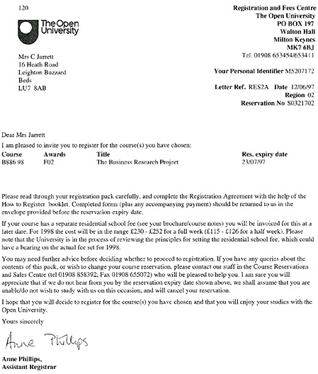
Problems we found in usability testing:
- Most students read the course description line and skipped the rest of the letter.
- What is a ‘res expiry date’?
- Payment is compulsory but sounds optional.
- Warning about importance of expiry date is not clear.
- Blocks of text are difficult to read.
- Paragraph mixes offers of help with warning messages.
- Nothing at the end to tell the student to carry on reading, many missed the contents list on the back of the page.
Introductory letter with amendments – after
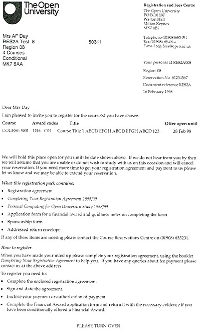
Changes made after testing:
- Clear headings and bulleted lists make the letter easier to read and to understand.
- Abbreviation ‘res’ removed.
- List of contents is on the front page so student can find out easily if something is missing.
- Messages about expiry date are in one place, clearer and more helpful.
- No ambiguity about need for payment.
- Instructions are clear, in order, and in one place.
- Student is warned if there is something on the next page.
Example 2: Registration Form
The student has to decide whether to accept a place, then how to pay for it. Some methods of payment, such as payment by cheque, are easy. Others, such as obtaining sponsorship from an employer or financial assistance from the university, are more complex.
The student has to fill in the form correctly for the method of payment and send it back with the right supporting materials, such as a cheque.
Examples of the Registration Form before and after usability testing appear below.
Registration agreement – before
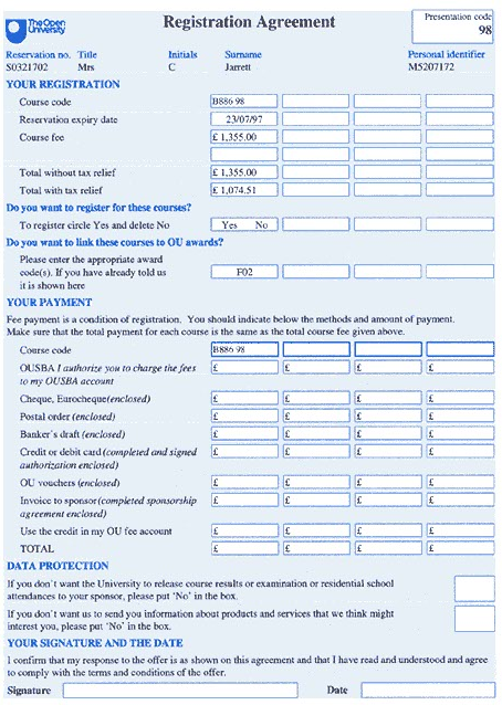
Problems we found in usability testing
- Presentation code is vital for sorting the incoming forms, but is hard to read quickly.
- Personal identifier is vital for dealing with forms, but is hard to read.
- Nothing to show that the reservation expiry date is important.
- Box with no description is confusing.
- The term ‘award’ is used in one place to mean financial assistance and in another to mean academic qualification.
- Section on awards confuses the task of dealing with payment.
- Three blank columns are confusing.
- Blue background makes text difficult to read and costs more to print.
- Nothing to link sections of the form to the appropriate notes in the booklet.
- Term ‘offer’ is introduced for the first time just before the signature.
- Nothing to tell you there are more questions on the back of the form.
Registration agreement with amendments – after
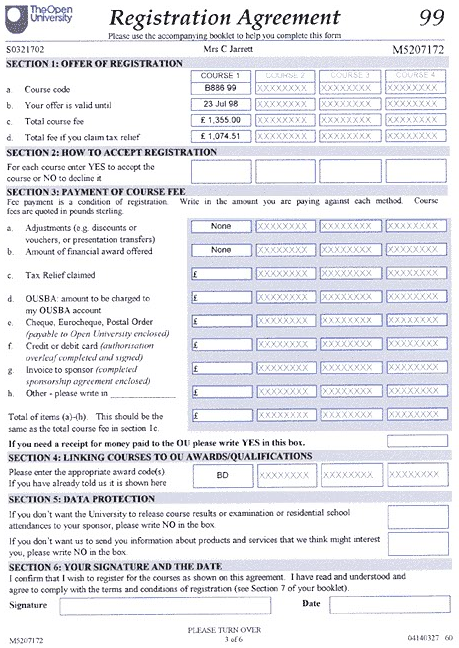
Changes made after testing
- Presentation code is larger, clearer, distracting text and border are removed.
- Personal identifier is much easier to read.
- Date is explained in student language.
- Boxes all identified.
- ‘Award’ is explained and used only to refer to financial assistance.
- Academic award section is separated from payment, and now uses the term ‘qualification’.
- Unused columns are ‘greyed’ out.
- Blue highlight now separates areas of the form.
- Sections and boxes are identified, and cross-referenced to the notes.
- Terminology for registration is consistent from start of form.
- Student is warned there is more to read on form.
Example 3: Booklet of Notes
The booklet of notes explains what the students have to do, how the different payment methods work and the University rules and policies that apply to registration.
Examples of the Booklet of Notes before and after usability testing are shown below:
Booklet of Notes – before
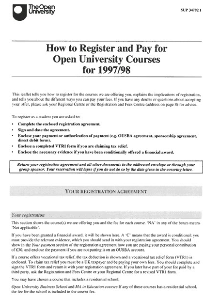
Problems we found in usability testing:
- Booklets for different groups of students looked similar.
- Text repeats information from the letters. Why should the student read it?
- Students used the booklet for reference, not for instructions.
- Important instructions are easily overlooked.
- Nothing to guide the student to the notes.
- Financial awards only apply to a few students, but are on the front page.
- Vocational Tax Relief only applies to a few courses, but is on the front page.
Booklet of Notes with amendments – after
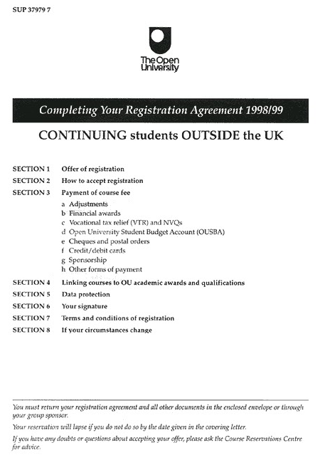
Changes made after usability testing:
- Booklet clearly identifies the target group of students.
- Section listing on front of booklet now makes its contents obvious.
- Titles of sections use the same terms as the form, makes it easier to find the explanations.
- Front page is clear and uncluttered.
- Sections in the notes use the same numbering scheme as on the form.
- All the instructions on the front page are relevant to all students.
- First page instructions are limited to the most important messages.
Case Study: Results
Effortmark’s detailed analysis of the interviews confirmed that the form was easy for a simple case. But it also showed exactly why students were making mistakes in the more complex examples.
The University reworked the form, simplified the wording and restructured the letter and booklet which go with it.
Ms Anne Phillips, Assistant Registrar in charge of the Registration and Fees Centre, commented at the end of the project: “We were reviewing the form anyway, but the usability work really helped us to focus on meeting the needs of our students and staff. This year’s version is easier for everyone. And the changes we made to the booklet have saved us 25% of our printing costs, which has already covered Effortmark’s fees.”
#formsthatwork #forms #usability
